Website of Elive, updates and changes

After a review from a friend that I met (expert in online marketing bla bla), I have improved a bit the website, with:

  • the menu can lead by default (new users) to a wrong click, in other words, the "download menu" was a drop-down list with all the downloads, but people may simply click in the word itself going to a little confusing page where there was 4 images of the different downloads --> this has been replaced by a single download option in the menus more visual and a well structured / explained page with the download options
  • (as said before), the generic download(s) page has been rewrited to something that should be detailed, descriptive, and intuitive to understand... thats important because new users don't know if they should use the stable or the beta (they are very different): Elive Downloads
  • some links in the website points too to this single download page
  • footer improvements to be more intuitive
  • header (menu) has been removed from the download pages (stable & beta), forcing a bit the people to download instead of going to other pages (that's the goal of the website basically), but the footer stills available with all the links on it

statistics will show if this is an improvement or not in the future, in the meantime, any special feedback about this modification ? :slight_smile:

1 Like

Yes.

Yes yes yes yes yes.

:exploding_head: :ohmygod: :1up: :applause: :happy: :excited: :rainbowyay: :happy_dance: :furrydance: :runningfast: :wow: :typing: :shocked: :eyepopping:

Tell your friend that, he is my new best friend :rofl2: (joking)

Suggestion for old versions site: it's possible to hand pick the ISO you want to download in elive museum on archive.org...include instructions and/or links???

Also...the "no header" seems a bit odd...out of place...I get that you're supposed to stay on the downloads page but there are people like me who go to the downloads page to see the gory details...and THEN i check out the rest of the site. maybe have a header that's closed by default but there's an arrow you click and POOF the header shows

:thinking: :thinking: :thinking: :thinking: :thinking: :thinking: :thinking: :thinking: :thinking: :thinking: :thinking: :thinking: :thinking: :thinking: :thinking: :thinking: :thinking: :thinking: :thinking: :thinking: :thinking: :thinking: :thinking: :thinking: :thinking: :thinking: :thinking: :thinking:

I like the way the download page is built. Nice :smiley14:

There are some glaring grammar and word choice abuses though.
Maybe someone could look into those. :thinking:

Yeah that could be very good, maybe @TheTechRobo which is good on improving the English and already did a good work from eltrans :slight_smile:

The only (big) issue is the way to do it with the website, we cannot have a real way to control it in the correct way (see differences / modifications, etc), but specially the website is a very delicate thing very easy to break, in other words, ideally should be done outside of the website, which is not technically possible, but maybe the best option could be to make a "wording fixup session", from a (building it first) copy of the website and then copy-pasting all the improved pages back to the original website :thinking:

By other side, note that not all the pages are meant to be improved because they are going to have a major improvement in the contents, structure, visuals, etc

If only there was an eltrans for the website... so much more organized... :frowning_face:

Maybe How to Easily Create a Multilingual WordPress Site and give us access to the string plugin...sorry, I know nothing about wordpress.

Or just open up a forum post...where we have to manually find the broken strings.

Great. :expressionless:

Well for one thing in the Beta description:
Never ever call your own product "inferior" so replace "inferior Experience" with something like:
"slightly rough at the edges" or "Work-in-Progress"
"Inferior" is a description that relies on a comparison ...... in our mind (and especially @Thanatermesis) the comparison is Stable but any new visitor will not understand and take it as a comparison to other Linux distros like Ubuntu, Mint or Fedora.

And it is actually written 3x in one paragraph :shocked:


My proposals ---

So the first instance:

  • replace "having an inferior" with "has a lesser" ..... and the Stable reference after it with "also", is bad grammar.

The second (next to the star):

  • Replace "Inferior Experience" with "Work-in-progress"

The third under the download button:

  • Replace "inferior experience" with "rough at the edges"
2 Likes

Perfect! contents updated :slight_smile:

1 Like

Homepage seems a little...what's the word...ah, "jiggled around".

You'll see what I mean:

On Logos and Banners of Elive - Elive Linux, add something like:

Use these wherever need be, as long as it is for Elive-related purposes only!

right below the title, to be like:

Elive Logos and Banners

Use these wherever need be, as long as it is for Elive-related purposes only!

I also highly suggest adding a menu that includes links to promotional and copyright and legal information, or maybe spread this across multiple menus?? I wouldn't expect logos to be found in "About", and not having both these suggestions is probably what caused cinelerra-gg maintainers to not know what they can and cant do with the logos, and also they didn't really have ANY logos except the main one.

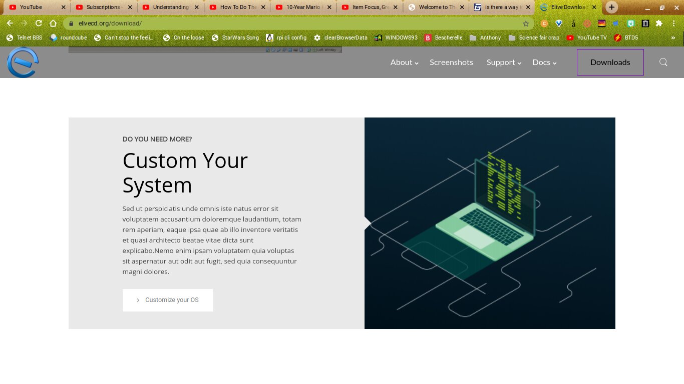
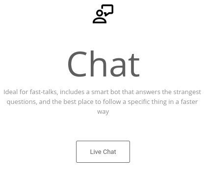
When you click "Support" it should take you to a page listing the most common issues solved, links to the live chat page (but NOT the live chat directly; I mean the page that suggests the elive forum FIRST). Also on the live chat page you should explain the differences (other than "low activity" and "better option".

Maybe add more examples of email signatures on the making elive more known page? Here's one (that you also said you liked):

Elive is a powerful, fast, and beautiful OS that works on computers up to 15 years old. It is the operating system of the future, that revives the past. elivecd.org

This way there's a bit more inspiration :slight_smile:

Also...

Every time you write an article or a Howto about linux*, mention Elive, or even better, use Elive for all the demos, captures, references, etc of the article.

I get that the * is glob/regex, but people will think there's fine print, that it's linking to (even though there's not)

Also, the making elive more known page should be in Docs, (or the promotion menu I suggested earlier), NOT support...what does it have anything to do with support (other than supporting the distro)?

On a few pages it has incorrect capitalization, i.e. linux rather than Linux, url rather than URL, etc.

Maybe switch Hosting suggested to Suggested web host, it makes more sense (better context, better order, etc)

On Elive FAQ - (Frequently Asked Questions) the title's off center with the contents. Also, the title should be bigger than the headings, not smaller!

Also... My Computer don't boot from the Hard Disk... Computer and Hard Disk should be lowercase (unless you want to go to My Computer in windoze lol) , and it should be doesn't rather than don't.

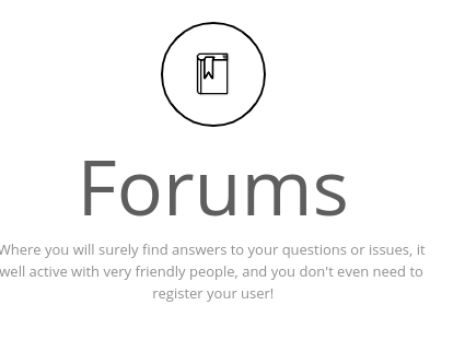
Use the Search feature in the menu to find your answer. Our new New Forums also include more FAQs and an active user’s community .

Ah yes, I love the new New Forums. (They aren't new anymore, either!)

Sorry got to go, hope this gives you something to chew over. :coding:

sorry for the long post, i really want everything to be perfect for maximum chances of more users

1 Like

In the CUSTOM DISTRO section:

Sed ut perspiciatis unde omnis iste natus error sit voluptatem accusantium doloremque laudantium, totam rem aperiam, eaque ipsa quae ab illo inventore veritatis et quasi architecto beatae vitae dicta sunt explicabo.Nemo enim ipsam voluptatem quia voluptas sit aspernatur aut odit aut fugit, sed quia consequuntur magni dolores.

Certainly not a good look, having seemingly unfinished website without any notice "under construction"...they'll be turned off immediately.

1 Like

logos and banners: added sentence
chat & forums options page: much-improved page following the suggestions, note that the page is meant to be the CHAT page itself (but cannot embed the chat anymore on the page)
improved wording contents in the make elive more known to the world page
changed "hosting suggested" to "suggested web host" in the footer list
improved FAQs page misc things

When you click "Support" it should take you to a page listing the most common issues solved...

Ok let's talk about this (@triantares ping), there's a small UX issue in the website where these "menus that opens" feels like they don't opens and probably users directly clicks to them (half of them in fact), that's why the downloads menu has changed...

Now, if I understood correctly, you are suggesting to set a link to the "Support" menu word itself that goes to a link like this one? Elive Bug Tracking SystemElive: Tasklist

In such case, it will be important to keep the bugs of Elive listed on the BTS website too (that can be a better way to help users track / search for their issues), this means that we should redirect always the users to the BTS website when a bug is confirmed real and needs to be solved :thinking: (yes this sounds a bit lazy to do, but in any case the BTS is the place to do that, and that previous link shows how friendly can be for that purpose)

  • Do we agree adding this link to the menu?
  • What about the "bug reports" link inside that menu too?
    • and, it should point to that listing link instead of the main one? (looks better and more friendly as a welcome I think?)

Maybe add more examples of email signatures on the making elive more known page? Here's one (that you also said you liked):...

Yes, let's suggest more things of this directly on its thread :slight_smile: https://forum.elivelinux.org/t/strategical-steps-and-automated-tools-that-any-user-can-follow-to-increase-the-elive-impact/1084

Support / Docs sections are difficult to organize (I mean, its needed a generic keyword where all its inside contents can fit correctly), so the word itself can be improved to a better one or also even changed, I assume that people looking the keyword "Docs" will search for documentation and then will have access to things like forum and tutorials and related to help "for them", and in support, well, this one is even more generic and its a common word that the people can know what they can find here :thinking:

@TheTechRobo I'm a bit confused with your suggested menu structure, can you show me your idea better in a kind of visual way like this? (very easy to write here):

  • Docs
    • FAQ's
    • Howto's
    • Q & A (this one is a bit confusing with the first one, so bad!)
  • Support
    • bla bla...

It's pretty difficult to search for an optimal keyword where users can find intuitively what they are searching for

yes, more menus can be added if these 2 sections are not enough

Sorry got to go, hope this gives you something to chew over. :coding:

:happy_dance: :dance:

where do you see that? doesn't shows for me :thinking:

It's a tad changed indeed and slightly for the better.
Knowing what you were talking it took me 2-3 mouse passes there to understand what you meant.
The idea is not bad but OTH what you're doing there is educating the visitor instead of making the design more user-friendly. Educating a visitor requires time and especially willingness by that visitor .... both are sparse commodities on the web. :face_with_head_bandage:

Agreed on both points from my point of view.
THe bug tracking page gives a much more professional vibe....that professional vibe is the big thing lacking IMHO.

As such, refering to the top banner, I still think that "Much FASTER!" should be reduced to "Faster" for a better visual equilibrity and get a "hammering", ascending rythm when spoken (out loud or in thought)......and delete the blinking "coding icon", it pulls the eye away from the text underneath.

  • Agreed, Q&A is actually the same as FAQ.
    What might be usefull is a link to the Stable docs that were made by the AbantOs project.

A lazy/quicky would be to directly link to the github page else use the text on a separate page on elivecd.org.

I haven't taken time to fully read and/or mark errors on the page.
Sorry, simple lack of free time. :work:

Also, it should be Customize Your System to make it grammatically correct. :smiley14:

Yes, I am watching Mario Kart videos. Trying not to lose all my VR on wiimmfi here :rofl2:

1 Like

image

Not necessarily.

There are two issues with this part: a) it's optional b) not everyone wants encryption

This sometimes starts at that, and then once I scroll down a tad further it restarts. Something to look into?

image

uh, yeah - but then they left-

image

That sounds like Elive will stop you from dying. :rofl2: Maybe change it to saving time?

1 Like

Just got around to the new chat page. Looks great.

image
Huh? Since when do you not need an account? I think you mean the irc, which doesnt need an account

image
In English, a "fast talker" is one that can get out of trouble ... so not the right wording imo.

Since when? Enlightenment.org has a "talk with us button" that works with kiwi irc .. don't know what you're talking about.


are you sponsored by Whitespace Inc.?

yeah that's what i was telling to him (the person who helped me to improve that), by other side its also important that the (new) user gets educated on the actual state of elive options (versions), because the stable and beta are too much different options (they can be even called different distros lol) so the user must know correctly what exactly wants / expect, before to download randomly

done

  • done
  • Oh I didn't notice the "lorem ipsum" thing haha - done
  • improved the "encryption" characteristic entry in the homepage

not sure what you mean, an error in the "animation counter"? that is not much up to me but more about the template itself, but if you think is important i could report it to the devs of the template too (need a video to show it, easy to upload to youtube from phone)

didn't gotcha :slight_smile:

haha well yeah its meant to be a bit funny but technically is true what it says (lives are saved if we count the amount of time lost, and damn, thousands of humans :eyepopping: :rofl2: )

  • hum yeah, removed
  • i probably invented the word haha, done

IDK, it worked on the past but not anymore, maybe has something to do with the NGINX configuration which doesn't allows to embed iframes from external websites, I tried to make it works previously without success, so a simple link was added instead :thinking:

  • shrinked bottom space - done :slight_smile:
1 Like

2 million users - that proceeded to delete elive

Will do.

And viruses are mostly made to sell anti-virus, similar as to how pharmaceutical companies sell cures, and we do not sell anything.

While with rogues/fakeAV that is true, most people don't realise it and so it just sounds factually incorrect.

the first step for Elive's screenshot page is just link to main.elivecd.org/ss - containing the screenshots from Stable which is where we are trying to get an impression.

found a small issue on contact page : 11 inch screen