Elive boot design booted in the last versions like this:
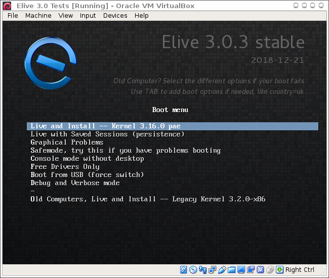
Today I worked in improving the stable indicator to be more visible and noticeable
In other words, so that people knows better if is a Stable or a Beta version
My actual design looks like this (It says Alpha, not Beta):
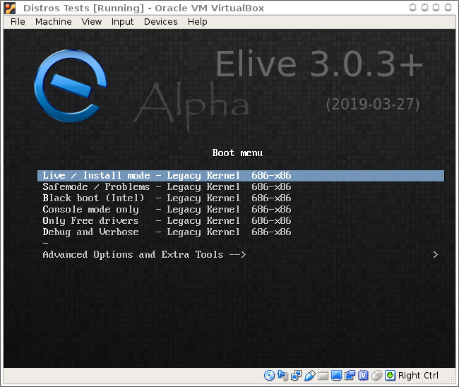
The idea is like I said, to make more indicative the status of the version
Opinions?