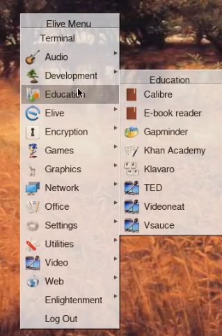
mmmh, this is e17, not e16 ![]()
the perl script is only a generator of the menus structure and their contents
mmmh, this is e17, not e16 ![]()
the perl script is only a generator of the menus structure and their contents
Not quite yet. The same files are used and they're still in~/.e16 and /usr/share/e16 and they simply have 2 spaces at the beginning of the text entries.
Yes .......but somewhere there's an instance that adds those 2 spaces as well as the icons for the categories ....... and I cannot find where. It's infuriating.
Oh, well, maybe the 2 spaces can be a good hack ![]()
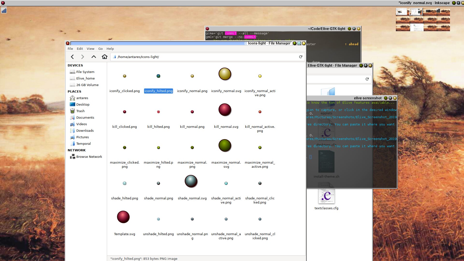
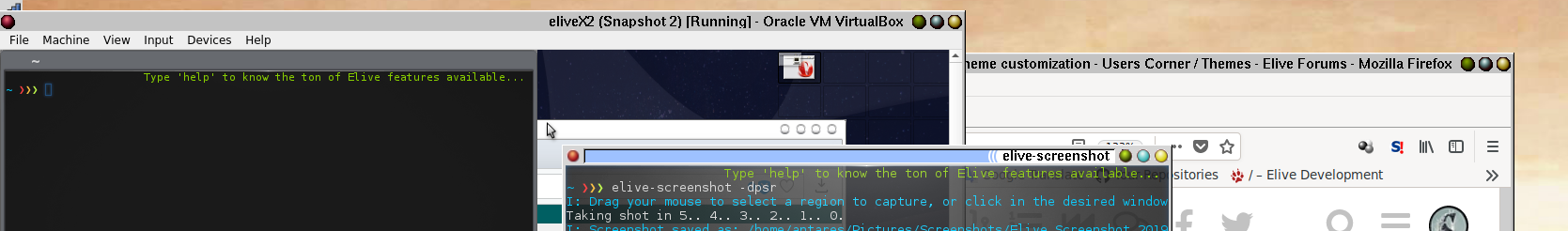
BTW I'm trying your themes
I like how the menus looks like in the cairo-dock panel (more clean, and good for a light theme), how I can use only the theme? (where is this conf?)
BTW you have 2 "japan themes" inside the cairo-dock dir, these dirs can be moved to its parent folder and found a totally new extra themes (they are a bit funny btw), I think that they should be removed from your sources
For the e16 theme, it will need some fixes, for example:
The easy "user" way is to simply copy/add the tar.gz into the cairo-dock, theme configuration window at the bottom.
The text suggest drag&drop will work, but it doesn't.
Installing it system wide would require unpacking and copying it into "/usr/share/cairo-dock/themes"
Yes I noticed and already removed them from my local repo but haven't updated them on github yet.
I have really no idea how the got in there, I used them on an my old thinkpad X200T for fun.
![]()
They do but I cannot find yet why the're a bit squashed ...... they should all be 12x12.
I'll look into that as well their lay-out .... was waiting for a comment before putting effort into that. ![]()
Thank you. ![]()
That's done in "textclasses.cfg" ..... yeah, I know ...... but what's in name?
setting _JUSTIFICATION_ 512 should do trick. It's also the .cfg where the menu colours are set.
It creates this:
Of which I'm not alltogether sure I like, it needs more room at the bottom . ![]()
The original isn't much better:
But somehow doesn't irritate as much.
Maybe it's an idea to leave out the "menu title" totally ..... as in all cases it is just a repetition of the category.
I altered the DarkOne theme to have text at the left side (with fancy-menus) and I think it looks mucho better. ![]()
OLD (aligned right):
NEW (aligned left):
This was done in "/usr/share/e16/themes/DarkOne/textclasses.cfg" by setting _JUSTIFICATION 0 (twice) for MENU_TEXT
Looking at all the possibilities, I think it is not a good idea that either @Thanatermesis or I change the "/usr/share/e16/scripts/e_gen_menu". An E16 upgrade (we are actually using an older e_gen_menu script version) would kill off all changes.
Let's leave that script to the e16 maintainers/devs and add our own scripts, in respect to fancy menus and icons for categories and beautifications in general.![]()
Some feedback on this point would be appreciated. ![]()
Actually I was keeping red (close) on the left hand side because DarkOne did that too.
If I'm going to the right side then it should be the same for DarkOne i.e move that to the right too.
I suppose I could remove the white (shade/unshade) leaving only the yellow (iconify) and green (maximize) to be more alligned with DarkOne.
Either way, it's your call. ![]()
Resolved. ![]()
sometimes when designing themes, this happens when the file itself is not 12x12 ![]() , its like an inverse issue, so let's say the image is 18x12, if you configure them to display in 12x12 they will be of course not proportional
, its like an inverse issue, so let's say the image is 18x12, if you configure them to display in 12x12 they will be of course not proportional
also make a look to their "border transparency" (they should be rounded images without a background)
playing with it i found that 0 is left-aligned, 1024 is right-aligned, so 512 is centered, and every other number is "in between" lol
yeah, I assume that this is cause from the padding settings in the imageclasses/menustyles.cfg (the one for titlebar i assume), if im not wrong the padding sets the shifted / padding values, but maybe your element has assigned a max vertical size and so the padding looks a bit out-of-limits ![]()
basically the visual issue is with the top VS bottom padding spaces
to improve the theme, i would try with this:
mmh, looks like a feature of "just like the same" as a window-border-title
yeah! it has been recently implemented this way by default ![]()
too late! ![]()
oh... don't worry about that, the e16 package is built-on-house ![]()
![]() , so updates of it will always include all the elive changes
, so updates of it will always include all the elive changes
the original one is more like a generic for all the distros, the modified by elive one (included in the e16 own build) is a customized version to fit the elive needs ![]()
by other side what i found that can be useful for improve or fix the e16 original code has been already send to them, like this commit : Making sure you're not a bot!
nah don't worry about that, every theme is different, in fact if you see the shipped other themes in the alpha versions some of them includes features that are not by defualt in other ones!
in any case, these buttons of darkone are not the most beautiful ones imho, if i change them it will be a big redesign of them ![]() , so not really something for the near future i think
, so not really something for the near future i think
with these icon / colors i think that is more intuitive to make them equal to as how mac does (minimize, maximize, close... if im not wrong)
Yeah, well I wasn't explicitly looking for a mac clone, I had e17 in stable in mind.
I'm creating some new icons in Inkscape for the themes using exported .svg files as as the original for the then exported .png files. Looks much better only still having some with the hard edge it creates.
The ones that are there now are too messy IMO.
Which leaves the question, for the default setting in e16:
I would like a vote or "likes" on that.
My personal preference is left side because I'm used to it now but I can imagine others preffering "right".
It depends on where the buttons are located in the window-bar;
if they are located on the right side
= close-button right
if they are located on the left side
= close-button left
They are both divided left right and right with the kill button on the opposing side of the others, in case you hadn't noriced. ![]()
![]()

Don't pay attention to the "light" buttons, they're ones I'm testing for looks ATM
Lego versus stransparrent. ![]()
By your example shown on image 2,
from left to right:
Option _____________ Maximize__Minimize__Close
(close should be red, imo)
![]()
just a wording note: there's a "kill" feature and a "close" feature ![]() the "close" is the correct (and used one)
the "close" is the correct (and used one)
answering the question: it depends of the theme (but generically speaking is better to follow standard/common ones, to keep intuitiveness), for a theme that looks so different like most of the shipped ones doesn't matter so much, for a theme like yours which uses more traditional buttons is better to keep them in the same order
hum, its not "minimize, maximize, close" on mac ? im confused now ![]()
if im not wrong that's the order also used on e17
Yeah, true.
I named the icons:
kill, iconify, maximize/unmaximize and shade in the theme.
Hence my choice of words. ![]()
They now look like this (the placement left/right is still up for votes BTW)
The git repository has been brought up to date. ![]()
Mac =
Close | Minimize | Maximize
High Sierra Theme:
Snow Leopard Theme (with "option-button" right hand):
Rebel450 Theme on Cinnamon DE (with "option-button" right hand)(with SpaceFM):
Where "minimize" would be "iconify", I suspect.
Not that it matters much.
I'm still thinking along the line:
So DarkOne and GTK-light shouldn't differ too much in "muscle-memory" only in how they look&feel.
I'm not sure about what the reflexes for most users are, in respect to having "close" left or right. That's why I'm asking !
Personally I liked and used Ubuntu's Unity a long time (stopping support is what led me back to Elive) which had a left "close".
Elive e17 has a right side "close" and actually requires you to look at what you highlight because the buttons are all uniform grey. ![]()
After a while I'm actually quite happy with my current buttons.
Frankly I'm especially enamoured by the "gree, blue, yellow" active-combo on the right. ![]()
Not bad!
But the colors of the buttons irritated me a bit, to be honest...
("what in the hell is yellow and what grey") LOL
They're all grey-ish if they're not active.
It's a feature not a bug. ![]()
IMO it's a good idea to keep "manipulation" icons separate from the "Close" icon.
I'm not trying to emulate a Mac (bad idea) just stealing what they did right. ![]()