VOTED ! =
:
![]()
![]()
![]()
![]()
![]()
![]()
2 Likes
wut ![]()
wtf, they has always been on the left side? im extremely confused now ![]()
yes the are the same thing.
yes I agree, that is a nice to have, but i dont think that we will have time (they needs some extra polishments) for implement the light one for these -now- announcements (they will be included of course in the next releases, with their newsletter too), or maybe we can have time to include it on the big amd64 announcement update ![]()
this is very simple ![]()
- most of them in the right side (like minimize, maximize, close), which is how windows is made
- mac has maybe them in a different order and position (i still have hard to realize that lol) but in any case they has always been:
- red for close
- yellow for minimize
- green for maximize
btw other buttons can be included too ![]() maybe you can put them at the same way as elive 3.0 by including the full-screen button
maybe you can put them at the same way as elive 3.0 by including the full-screen button ![]() (four buttons), the only important thing is to keep them intuitive (and if triggers curiosity, is a good thing too)
(four buttons), the only important thing is to keep them intuitive (and if triggers curiosity, is a good thing too)
but again, the most intuitive method is: minimize, maximize, close (on the right), most biggest % of users are used to that, and btw im just writting from chromium which has its own borders and it has it that way too, and just to verify, i ran file-roller which has own gtk borders system and has it the same way too lol
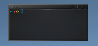
mmh, thats right is a bit confusing, i don't know what is blue for (actions / menus?), but looking at it I would suggest this structure:
[ actions ] ------------------ [ minimize ] [ maximize ] [ close ]
(remember, the darkone theme is not optimal too, it was just made this way)
Yeah but that shouldn't be too hard to alter on DarkOne. ![]()
And should actually be done for coherency if right side is definitely chose.
We could even make it a user choice. ![]()
The blue "shade" icon isn't really needed as it's also available on the right-click of the top border....It's just a button I use a lot to access windows underneath.
As for the majority of users coming from Windows: I'm not too sure !
At my daughters Uni classes there's mostly Apple these days.
Nah,
the order of the buttons is kinda standard.
For example on Xfce you ( user) can order the buttons by his own preference, there is an extra control panel for that.
THOUGH the default comes with the order like
Win. All distros that I know, does that the same way.
And so
we should not re- invent the wheel here, imo...
![]()
Well actually Ubuntu did offer that exact option on Unity. ![]()
But in this case I insist that DarkOne have its "close" to the right as well.
I'ma a strong believer in consistency.
Anyway, since when did "all distros have that" become a viable argument in Elive ? ![]()
Done that for GTK-light.
Looks like this now:
@Thanatermesis Shall I alter the DarkOne too??
BTW,
It's in "../borders/default.cfg"
And padded the menu title:
that's because you life in the first world ![]() j/k
j/k
yeah sure, i would like too... i just have other few priorities first ![]() , like the release and also the switching to the newer desktop (which is a gigantic, inhuman work)
, like the release and also the switching to the newer desktop (which is a gigantic, inhuman work)
as said, it was just set this way, it will be better if modified in some future ![]()
about the blue icon, i think that is good to have it (because not many people right-click on the border and so they will never discover these amazing options)
that's right ![]() but is not about "doing at the same way as others", but about having the intuitiveness (which is on this case, what they are most used for, and if you change these buttons too much, they will be scared on a first try lol)
but is not about "doing at the same way as others", but about having the intuitiveness (which is on this case, what they are most used for, and if you change these buttons too much, they will be scared on a first try lol)
looks more intuitive now ![]()
I wonder if "flat" looking buttons should look better ![]() these are not easy to find things! heh
these are not easy to find things! heh
mmh nah... this theme has a very specific feeling/personality that I want to maintain ![]() these kind of buttons will not match very good on it... it will be needed something pretty different i think, but what? i don't know yet
these kind of buttons will not match very good on it... it will be needed something pretty different i think, but what? i don't know yet
I just found this on google, its simple and intuitive, without impact big in the visuals (changing the personality), may be an option
ah! much better! ![]()
Ok, I have passed all the night trying to implement a concept of buttons for DarkOne...
now I think that the name must be changed, since it doesn't looks like the original design ![]()
I would only say for now one word: retrofuturistic ![]()
and even better: intuitiveness is the most important and this has been correctly maintained ![]()
Ok, if you go for those buttons in "RetroFuturistic" (I tend to associate futuristic with the 30's)
so maybe "EliveNight and I'll flatten the buttons and call it it "EliveColor" ![]()
No a big change after all just a bunch of icons.
My only prob would be:
I think a blue triangle for shade/unshade would be good but then there'd be a problem with the "close" button. ![]()
Other wise a _ for "shade" and | for "unshade" maybe. ![]()
Finally you both are on the right path
Keeping up the 'being unique' idea, good ![]()
I was thinking in something more simple and intuitive:
Elive Dark & Elive Light
colors will have both ![]()
small preview ![]()
somebody impatient? ![]()
@yoda may like that ![]()
2 Likes
I am still in doubt about the "close" on the left or right.
Reality is that until since a short time, the "close" has been left sided on both dark and light theme.
There haven't been any complaints AFAIK !
I believe that "close" away from other buttons is the most ergonomic solution. Nobody want to close a window with a lot of unsaved work by accident as the other manipulation buttons are only a finger tremor away. ![]()
So actually I would like to make a strong point about "close" on the left. 
I can make more arguments there but IMO the close proximity of other buttons is a design flaw.
BTW, I like the simplicity of your preview. ![]()
Tried flat colored buttons in EliveLight and my conclusion is they definetely need borders, like you have there too, good. ![]()
Me, I like it - but could you create the buttons with
-33% less of their actual size, they are a bit too big...
On Unix driven OS there has been this feature
with 'close' button at left hand.
On more user orientated OS' s
like Mac or Win also Gnome and KDE DE's -
it is always at the corner of the window border.
As someone we know said earlier herein
users (especially newcomers) will be prolly driven mad with strange positions of buttons.
Well,
that's your feeling and you are of course free to have it, but...
In real life a lot of specialists created this szenario after a long period of tests and investigations.
I am saying all this, because am feeling a bit scared that you could wish to put your idea as default
on a fresh installed Elive - but ya ain't, don't ya...
1 Like
This has already been the default case since 64bit alpha has been available.
e16 DarkOne has a "left sided" close and so has GTK-light theme.
You didn't notice, did ya?
See that it is more natural then you think. ![]()
I don't give a damn about what has been done before ...... we'd still be rowing wooden ships if people listened to that as an argument. ![]()
I know, I was one of the testers in the late 70's ..... using Xerox machines.
After that no-one dared change anything ..... except Steve Jobs who was prepared to turn everything upside down to changes things.
Stick to the philosophy: "Elive is art, like it or leave it" but do not blindly follow others, I would add.
If I get my way ..... if I can, I will.
As a compromise:
"Close" on the right and manipulation icons on the left is also a good possibility...... but keep "close" apart.
Thus making the " Do you really want to ..." dialogs unnecessary. That is a clear indication (aka stupid repair) of a design flaw.
Mhm.....
still a bit strange, but ok so far.
By the way:
Are you a ' left- hander "
( this would explain that strange desire...)
Sure, I noticed - that's why I always switch to another Theme as first action after install and go into Enlightenment settings ![]()
There was (and still is) a good reason for it.
It is in fact a more ergonomic haptic to have the layout like this - (for 'right-hander)
![]()
I don't believe a word.![]()
Proof please.
Links to white-papers or serious studies are meant, by that.
IMO it's just a habit that's been forced on us by years of MShit, that's all....
And no, I'm not left handed. A stupid assumption that left handed people would prefer a left handed "close". Left handed writers would actually prefer access to a right sided "close" (if using a pen on a screen) because it would give a free view of what they're doing.
Right handers would prefer a left sided "close".
I'm not wanting a left or right side (I don't give a shit) ...... I want the "close" icon separate from the others for a valid reason IMO, c'est tout. It is the only icon with real consequences!
You have not given a single good argument pro except: "It's always been this way" and that is exactly a reason to deviate.
And pray tell, which one you then install?
big here is a good thing, I mean, for this kind of theme which has small borders, otherwise will be harder to "point" at them, making it frustrating trying to pick the correct pixel ![]()
that was not an elive decision ![]() it was like this because the original theme did it that (have you see the other themes buttons btw? some of them are pretty strange heh)
it was like this because the original theme did it that (have you see the other themes buttons btw? some of them are pretty strange heh)
actually darkone has been moved to "Elive Dark" with these buttons changed to more standard
that sounds to me like "everything is broken, massive rewrite needed" lol
don't worry for that, people is very used to pick the close button from the right corner, problem will be only if the buttons were too small and picked the wrong one by error (the actual "elive dark" theme makes it very visual with the lighting-colors)
ok, no issues anymore now then lol
which theme you used by default, btw? StarTrek one? ![]()
(no proof of papers), but in a fast thinking I would say:
- things are used to be on the right, maybe because reading (in most common languages, from left-to-right) finishes on right and so is when you need to do the next step
- since other elements are on the right too, the distance to "walk" for other action buttons must be near
- right-hand tends to "relax" on the right side by inertia
Taking your points one by one:
You'd have to define "common" in "most common languages" .... as in absolutely most users, most languages or most computers?
Anyway I don't see a need for a "next step" (or would that be Jobs' Nextstep? ![]() ) in the top menu of a widget other than reading what's down below it.
) in the top menu of a widget other than reading what's down below it.
That would be an argument to NOT have a close button there ..... it's counter intuitive.
Which is exactly what I'm making a case against. "Other" actions do not have possible destructive consequences, contrary to the kill button. I'm daring Elive to make a design statement there! ![]() One that can be defended .... and if at all, even with initial dismissal: Will generate "noise" on the net.
One that can be defended .... and if at all, even with initial dismissal: Will generate "noise" on the net. ![]()
So? That would be your mouse, this is about the pointer.