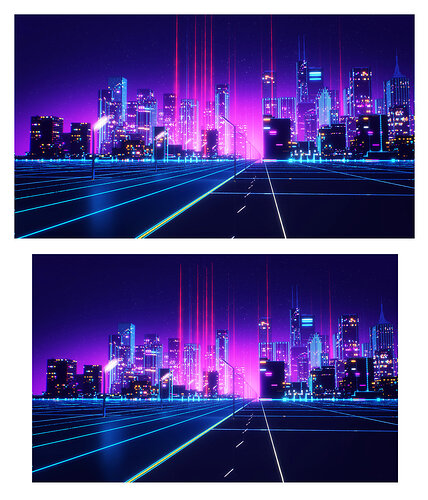
Much larger and ever so slightly better.
I'm surprised that you didn't remove that little stripe at the bottom while you were at it.

Combined with a transparent dock below, it looks strange.
It is an upscaled version of the original file. Double size and just a tad sharper, but no retouching.
As is, not even the proportions are correct. It's not 16:9, not 16:10, not 3:2, not...
That tiny white line part is normally hidden behind the dock.
Modders will have to mod it away.
A proper fix would actually be something like this.
Add missing parts of the picture on the top and bottom; instead of removing that lantern part, add it, and then rescale to some standard size like 2560x1600. That would also make it possible to cut off the bottom and get a 2560x1440 image with the 'clean' part behind the transparent dock.
updated wallpaper with minor fixes
the bottom artifact has been simply removed in order to not look strange with the docks


