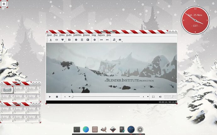
As we have seen in the past, the default look of SMPlayer is very dated.
The easiest way to change it is to install the Theme Pack and select one of the freshly installed themes.
You can easily install it with sudo apt install smplayer-themes.
But what if you want to customise a theme?
Installed themes are not a good starting point. They are usually something.rcc.
They are compiled and would need to be decompiled and recompiled.
There is a tool that can do this, but it's an unnecessary step.
Instead, go to the SMPlayer homepage and download the themes package.
Whenever you attempt to make changes to themes, it is a good idea to make a backup.
To make them easier to access, I put them in my home folder. In the case of SMPlayer, that's in ~/.config/smplayer/themes/.
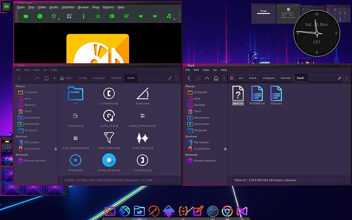
If you have downloaded the uncompiled themes, they are easy to modify if you have a minimal understanding of HTML/CSS syntax. The themes consist of icons and a style file.
The most important thing to know is that, unlike gtk-2.0, you cannot # hide a file, but you have to do it with /* hide */.
If you have never edited HTML/CSS files before, I would suggest that you check the basic syntax and comments before you start. You could also look at the colours section.
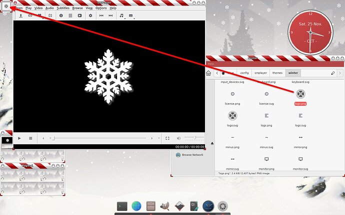
Changing icons is fairly straightforward. Pick any icon you want to replace the old one, but make sure the name stays the same. For example, you could take the player command icons from the BeautyLine (Actions) icon set and replace the "Play", "Stop", etc. icons with these shiny multicoloured icons.
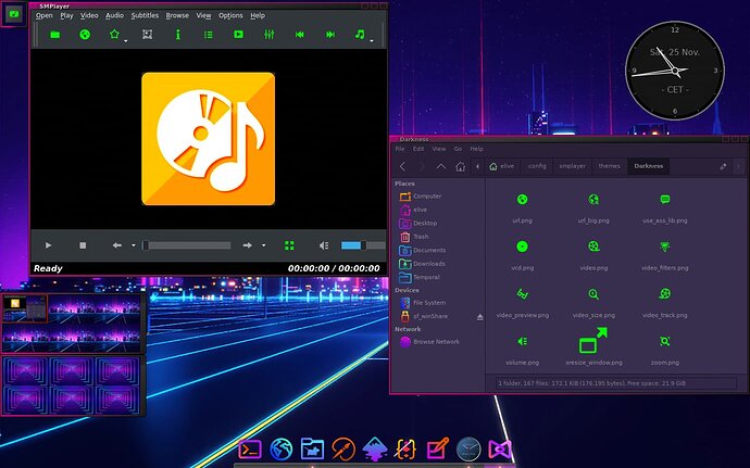
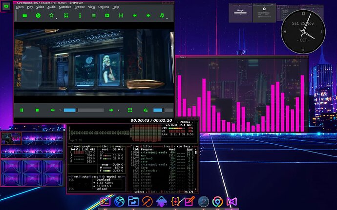
For my tutorial, I chose neon green icons instead.
It is IMPORTANT to note that the colour of the icons depends not only on the colour of the icons you are using, but also on the style file.
There is no error in the image above. I used all green icons, but the style file changed them back to grey.
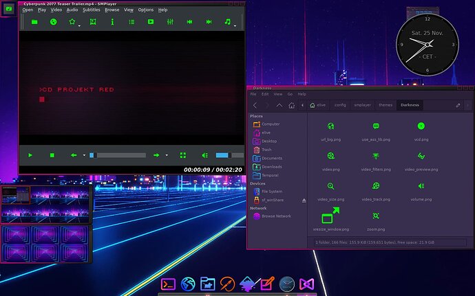
The style file can define images to be used and can also change the colour of the icons for different states (active - inactive).
Note that the exact same icons are used here, but they look different during playback.
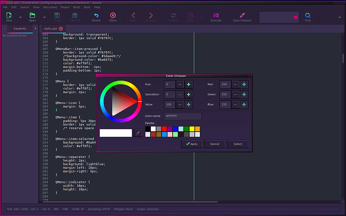
Before you make any changes to the style file, I recommend that you install Geany.
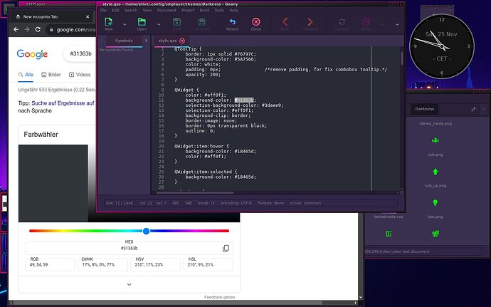
Geany has some very useful built-in tools, such as the colour picker.
It lets you pick a colour from anywhere on the screen.
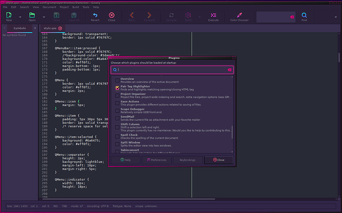
You should also install the Geany plugins.
By default, it will look out of place, just like SciTex looks right now, because it will have a bright white background, unlike the dark rest of the system.
To fix this, you could get a theme pack with many different themes, or just get the nicest dark theme available at the moment.
Google can help you easily identify the colours if you don't know the code by heart.
This way you can re-colour the SMPlayer interface bit by bit to make it look like the rest of the system.
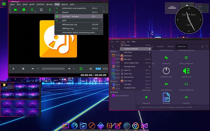
For my example, I have simply recoloured the menu from blue to grey.
One thing to be aware of here is that sometimes your theme may completely miss a property that should be recoloured where you would expect it. This is because some colours are inherited, and the theme author hasn't added a property a second time (because it's not needed and only slows down code execution). This means you'll have to add it yourself, according to your needs. The link to the place where you can look up the syntax is at the top of this tutorial.
In my case, there was a font colour defined, but no background property.
For some tips on recolouring, click here.
Have fun!
===========================================================================
Download my unfinished theme: Neon-Green
===========================================================================
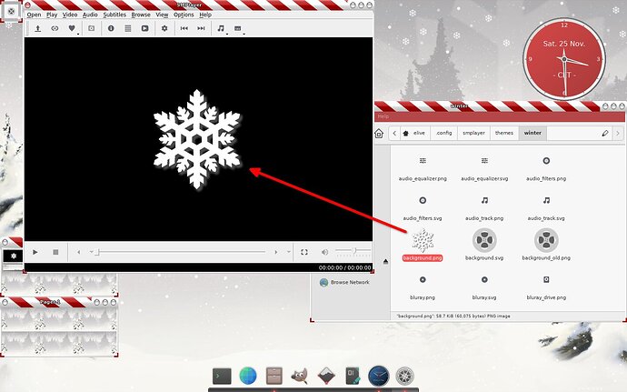
The last tip:
Et voilà!
