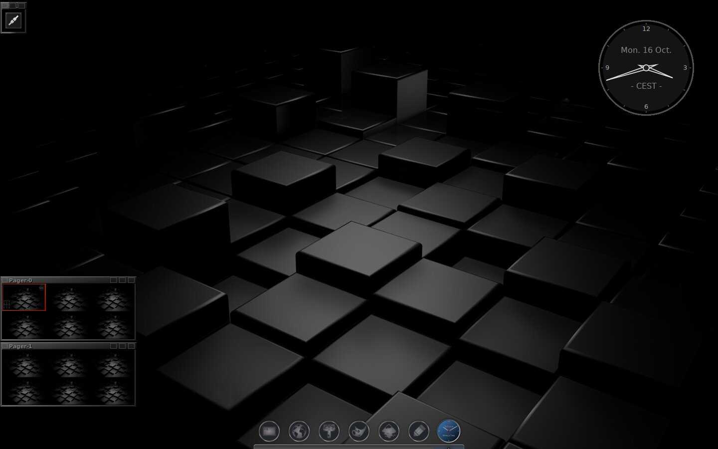
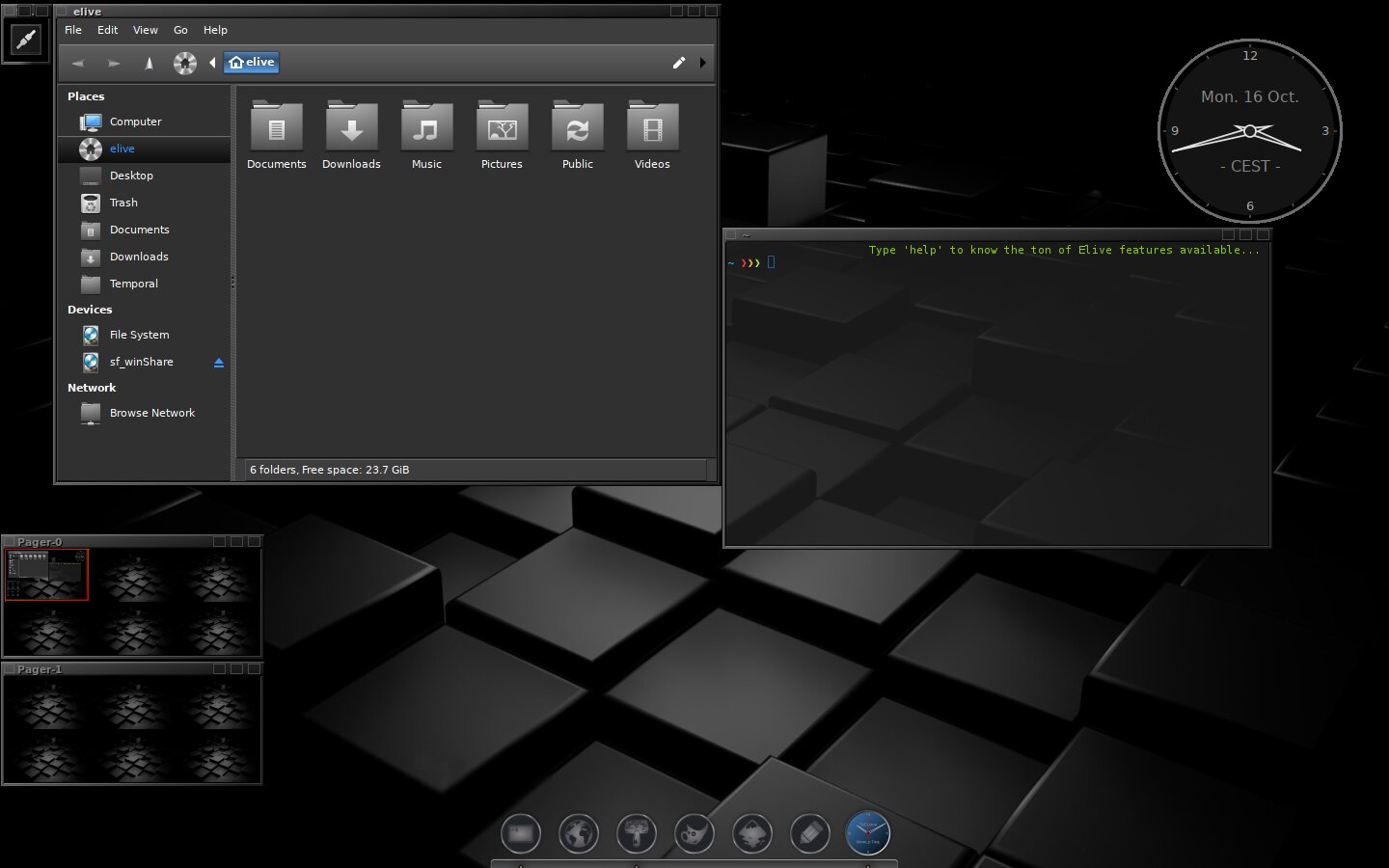
The theme used was Elive Black, E17 gtk revolved, Plank Dock with custom dock icons, TzClock, a custom icon set made on the basis of the Enlightenment E17 folder, and a mix of 'anything that might fit'.
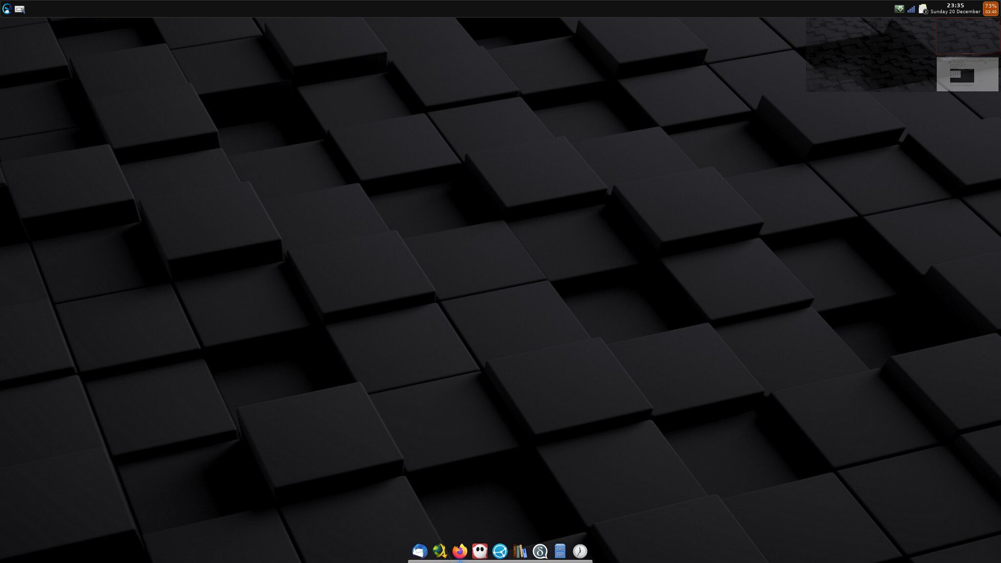
That's not the same wallpaper as the one I used.
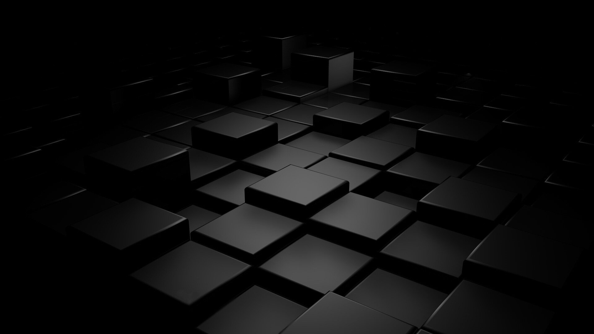
If it were, it would look similar to this:
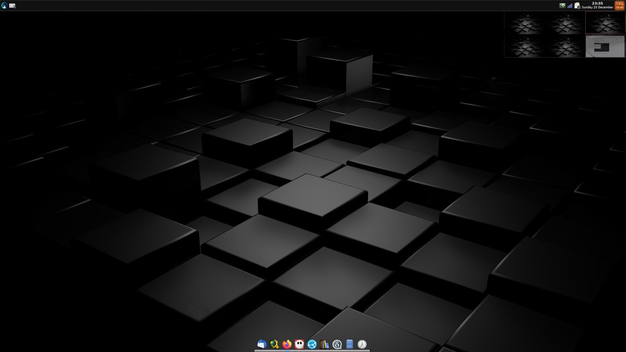
You were using one of the versions of this wallpaper here:
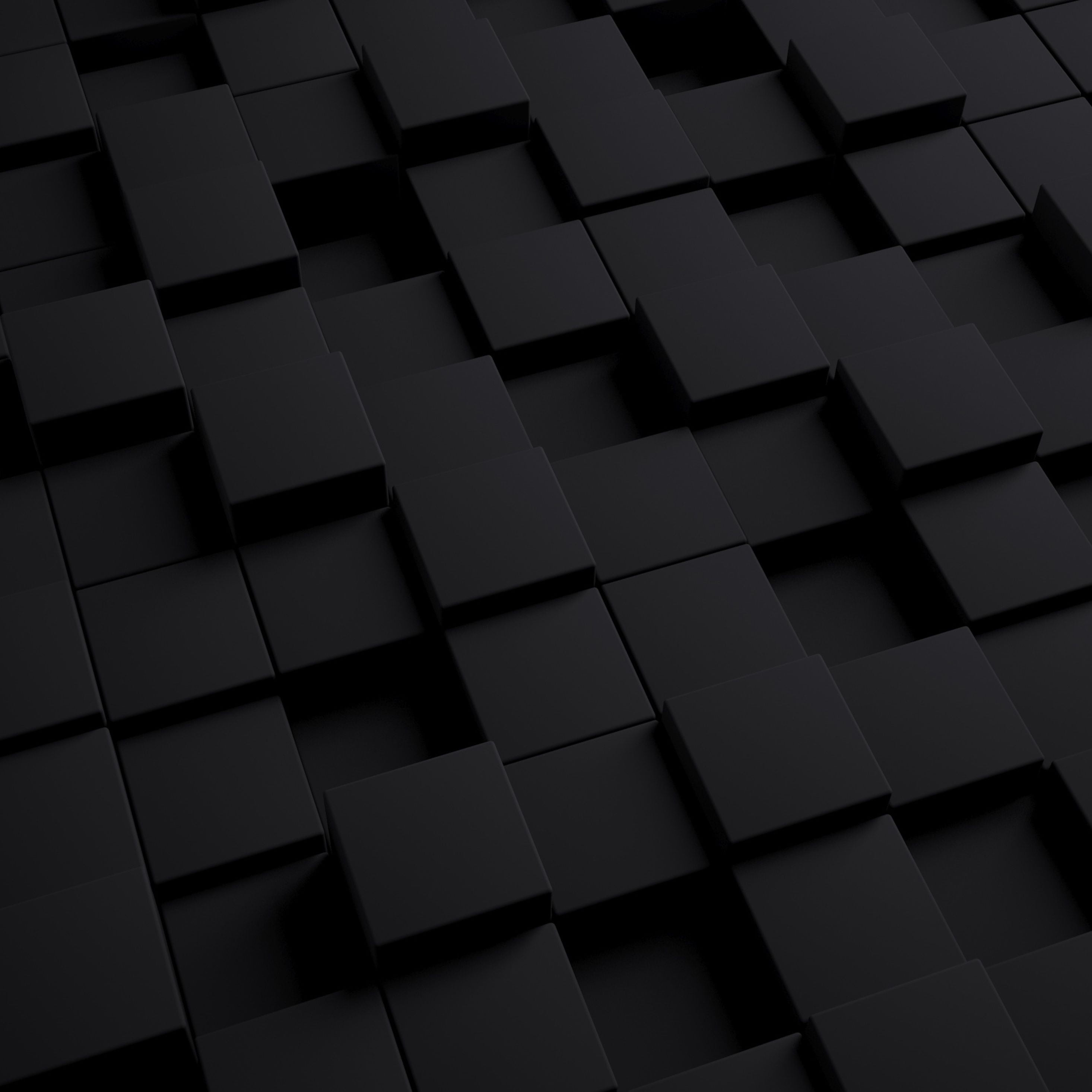
There are a few different versions available—wide, square, etc.
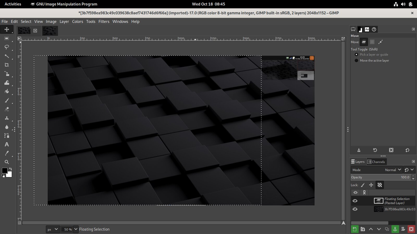
If I take that one and purposefully use the wrong scaling to mimic your malformed cubes, it's easy to see that it will look like the one in your screenshot above.
This was the image used by me:
True ..... there are quite a few versions out there.
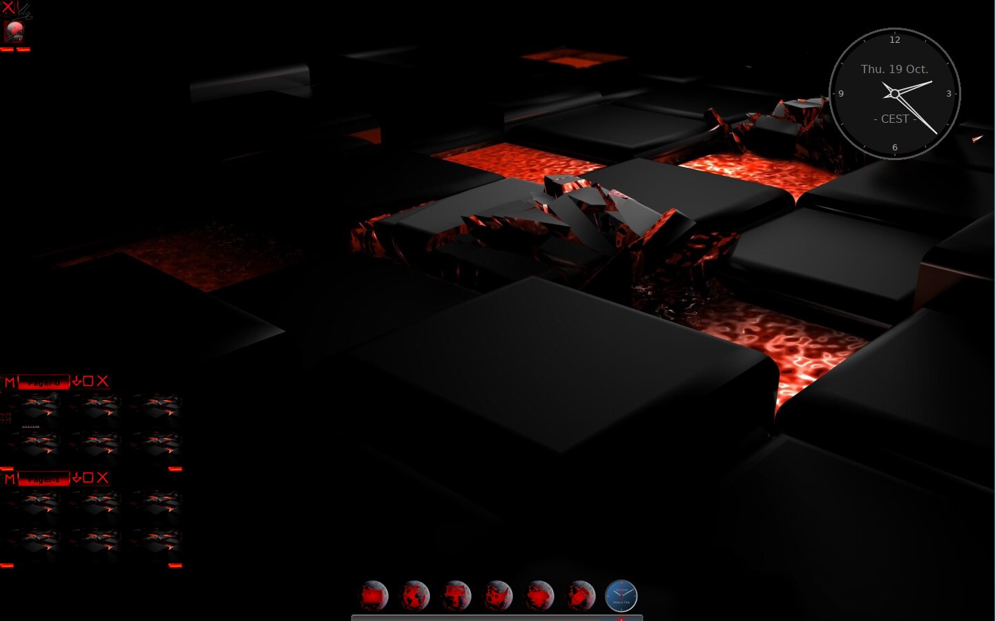
I like the fiery one the most. ![]()

If I'm not wrong, they're all bitmaps rendered from the same 3D object (blender?) at different zoom levels and angles
Oh they certainly fit better with the coloring but not really my thing.
Actually with icons it's always a trade-off between esthetics and function.
I personally find that the primary icon function to show what it represents. If I have to hover over an icon to see what it actually represents ..... IMO it loses its meaning.
Where the icon set I was using there (it's in the Elive repos for Retrowave) also bothers me a bit ... in the sense that the icons are visually hard to discern because they've got the same color gradient. They require a second look. ![]()
As to the Desktop ... I've still to take time and find a way to have (in E16) the pager transparent i.e not miniature replicas of the wallpaper. It creates a disorder visually, depending on the wallpaper. ![]()