New Download Beta's page (work in progress)

I started to work on making the website ready for download the new Alpha / Beta versions, much work has been done yet and everything looks very promising.

Today I wrote the future /download/beta page, which looks right now like this:

https://www.elivecd.org/download/beta-0/

note that some texts are not finished, buttons or links not fully working yet, I'm still working on it!

So, how it looks so far? I felt inspired :slight_smile:, I think that the usability / wireframing / information is pretty good

What about the messages that are already included?, suggestion for better saying / communicating things?

Other suggestions?

mentions: @yoda, @Rebel450, @maxinou, @triantares

In a quick scan I see some language problems.
The looks fits in quite well with the other pages, nice. :applause:

Sweet work done = :+1:

Will come back later with suggestions :thinking:

Yeah, and well, all the process is not so easy, things has been done right now like this:

  • brainstorm what is needed to include
  • brainstorm how the information should be distributed
  • brainstorm how it can look "visually nice and intuitive"
  • brainstorm what should be said and how

So now, since the page is pretty ready, the wording improvement can follow these steps:

  • we are including all the info that is wanted / needed to include?
  • is there "better ways to say it" ? (shorter, clearer, clever, and emotive) (ping @Rebel450 :slight_smile: )
  • improve the english / wording

yup, and even better than other pages! im pretty happy with the result, hopefully the website will look everyday better (there's too many pages with wrong info, wrong design, etc...)

What I found pretty importante to make clear, now that I remember it :slight_smile: is to say that e16 is a temporal desktop! we are not going to progress on this way!, of course not saying that e16 is bad in any sense, but just making it clear that is:

temporal

temporal

temporal

temporal

temporal !!!

yeah! this ^ means that its included now but not in the future!

(ok im exagerating a bit... but yeah, it needs to be clear)

in short, nobody should see it as a "final desktop / result / environment" and of course not that we are going to follow on this direction.

So, suggestions for that?

BTW the downloads page (the one with the links i mean), which im updating, I just included the TEMPORAL thing as a negative detail from the List, looking like this:

note: with "apug", elive-screenshot now doesn't include these black borders ^ , this is made by cropping the image 1 pixel in their borders :happy_dance: @yoda :wink:

1 Like

May I point out that the word "temporal" is not the correct one needed here, it should be "temporary".
Temporal is generally used in anatomy, like "temporal lobe" or "temporal bone".
So in all your texts and pop-ups:

sed -i 's/temporal/temporary/g'

I never pointed this out to you as somehow I found your usage of temporal quaint and part of your personality. In the same way the Italian maker of the "muLinux" distro used the word "rustical". :smiley:
http://micheleandreoli.org/public/Software/mulinux/
I really learned a lot from that little distro. :smiley:

In combination with E16 I'd use words like "stand in", "transitory" or "ad interim" too.....My personal favourite for the website text there would be "transitory" i.e making clear that it is only a phase we're passing through on the road to a final E22 based Elive desktop.

On quite another note:

Do not make excuses for E16 but flaunt it!

So put a a green pro mark before it !
What you're doing there is bad PR and certainly not a nice gesture to the E16 maintainers. :nauseated_face:

It's like with flaws: You can try to hide/camouflage them or you can accentuate them and make them part of the experience.
Most of the best works of art are based on a "mistake" or "flaw" which got resolved and incorperated and then brought about a whole new way of working. :applause:

2 Likes

ah! maybe that's because I always felt "temporal" as a very coherent word for me (in spanish is spelt the same way) :slight_smile:

transitory... :thinking: not bad

"transitory desktop used for development" ?

hum, maybe not a bad option!

by other side its needed to put it in a way that the user would know that is not going to expect something so well polished and featured as the stable version, that's the important thing... otherwise: (bad) suprirse!

heh
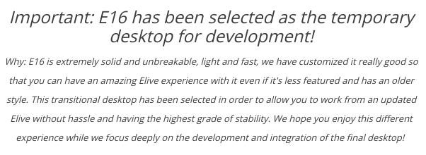
well, im the first one (or maybe the second one, after you), to really like e16, I used it for much years too

but im just being realistic about the fact that:

  • it lacks features
  • its less beauty (impressive)
  • it has less possibilities
  • it has less options / settings

not saying that is bad, it is not bad at all! and is soooo rock solid! its just extremely good for a working environment :slight_smile:

what i try to communicate (to the users / visitors) is that they should know what they are going to see and that is very different than the stable version.

And also, we know how are these "troll reviewers"... a lot of people (oh wait! maybe all over the internet talking about this version! :eyepopping:), just because of the "Before was E17, now it is E16" feeling, they could argue about that in bad way

So its very important to not give them this "unexpected surprise" (not good or bad, just INFORM)

So well (brainstorming myself here), what i think that is important to communicate is:

  • this is a temporary desktop
  • we are working in a better desktop environment
  • the stable version will not include it / it will be another

:thinking: :thinking:

Maybe we just need a big centered sentence saying this message in a short and clear way

Important: we are using E16 as a temporary desktop for development! a better one is on the way

something like this? :thinking:

in such case i can simply remove the [*] thing and its color, so its not a good or bad thing, but needs to be notified

This gets the message across without knocking E16...

Trolls do what trolls do.....so don't mind them.

I think your "realistic" downsides can all be summarized into "minimalist" and used as an argument why it was chosen as a transitional desktop, together with all the "pro" points like stability, speed and simply getting out of the way.
To avoid being designated as a downgrade we have to hammer down that e16 was a deliberate choice and that using e17 was not a viable option.
On top it is also a means of showing that Elive is a real distro entirely and not just Enlightenment slapped on Debian. A proof of concept and thus an argument pro.

But people will compare with stable, hence my efforts in ironing out inconsistencies and acquiring some looks (pager & icons) reminiscent of the stable e17 desktop.

Actually my first view of e16 on Alpha, was extremely dissapointing..... especially due to the menu's small fonts and lack of prettiness (icons), the too small pagers (I still think 2 desks is messy), the maddening sounds and the overall outdated look&feel of the themes. :eyepopping:

I would summarize those three into:
E16 is chosen as a temporary working environment in the transition to a full blown e22 desktop. In time, the stable Elive version will not have e16 as the default choice but will continue to offer it as a tailor made lightweight alternative.

I think we could even consider (when e22 is Elive ready) making the e16 version totally free and the e22 (incl. e16) payant.:thinking:

1 Like

yeah of course, but is better if we don't show some food-for-trolls around :smiley:

thanks, very good points :slight_smile: I will leave this TAB opened for tomorrow to work on that

yeah, I saw in your theme that there was some good similarities with the e17 default's look like in the stable version :thinking:

unfortunately I would like to release it publicly ASAP and the light theme needs a few fixes / improvements :thinking: hum, I will try to make a look to it tomorrow and see if i can help in the (hard e16) code of the theme, which of course, will be pretty nice to give by default these options of light / dark themes to select

ok well:

  • yes e16 themes can look outdated, thats a limitation in the possibilities (basically)
  • sounds well... they can be disabled :slight_smile: but it adds a funny / strange / different feeling for discovering this, can be called different desktop experience
  • some people loves these small fonts (like me too) and some didn't, maybe they could be increased a bit by default, hum... not decided yet - note that this is a good thing for small screens and we cannot have dynamic sizes
  • the two pagers are for a reason: they are not the same thing, they are 2 different features (and E16 is the only window-manager which features that), htey are:
    • virtual desktops (the horizontal - vertical aligned ones), acting like a single big screen, as you can see if you resize out-of-the-screen-limits a window (and this is a really nice feature, in order to reach outside buttons of an application on small screens)
    • multiple desktops (this is more like what we know as virtual desktops in other window-managers, including newer versions of enlightenment), they are independent, I (personally) use the second one for tasks which requires longer processes, or "offtopic tasks", etc (switch to them with ctrl + atl + shift + arrows)

I like it

btw, do you think is good idea to (already) say e22 now? I mean, by one side e22 vs e17 is not fully decided yet (but has pretty much bigger interest and reasons to), and will also remove the "surprise factor" (which by other side can be a good thing for people to start talking about it?)

yeah, sounds good, but is not better to just stick at "32bit vs 64bit" ? (this option also features that people which will require 32bit will not have (generically speaking) much money to donate

As long as it is undecided which we are going for (although I think e17 is maybe not dead but starting to a smell a bit funny :rofl:) we could just leave out "e22" or maybe use the word "final".

Oh yes, certainly do keep that but even then use the paying to show where all the work went.
Users will install the free (64bit) e16 version and want more if they like e16. if they try to install e22, on the cheap themselves ..... will have in most cases a disappointing outcome. Making clear it's simply worth a few bucks.
In that situation e22 would have to be payant for 32bit as well ........ Otherwise who's stopping me simply migrating to 64bit?

Anyway we're not that far yet, so let's stick to what we have for now. :smile_cat:

i like that, using "final" is simply nice :slight_smile:

nah, users forget messages and if they try e16 which will be "less featured" they will leave with that concept-of-elive in mind, instead, if they try a nice more customized and featured desktop they will leave with this better "good taste", thinking on the 64 bit version...

i think that the 32bit version should show the same features but being simply a more limited system

nothing is wrong by migrating by themselves, but it will be some manual work (which is simply easier to donate 5 bucks), stills makes the isos unable to boot on uefi and other things like different packages setup (to be lighter the 32bit version)

Ok, the page is updated with an improved message following the @triantares suggestions and points:

image

pd: the updated elive-screenshot tool with the black-border issue remove just looks perfect :ok_hand:

I propose text change to:

Why? E16 is extremely, light, rock solid, unbreakable, and lightning fast. We have customized it really well, creating an amazing Elive experience despite the original e16 being less featured and having a dated style. This transitional desktop has been selected to allow for a hasslefree work environment from an uptodate Elive guaranteeing the highest grade of stability. We hope you enjoy this unique experience while we focus on developing and integrating the final desktop.

3 Likes

I was just brainstorming a different entire sentence (before to read your post), which is shorter too:

Why: Elive customized E16 in an amazing way to allow you to work from an updated Elive without hassle and having the highest grade of stability. E16 is unbreakable, light and different, play with it and you won't regret the experience!

I like your proposed change too, let me see if i can make it shorter (from the website it looks a bit saturated of words)

1 Like

I would like shorter too.
I kept things in line with your first text to not create too many questions.

Your version a bit shortened :slight_smile: :

Why? E16 is extremely light, rock solid, unbreakable, and lightning fast. We have customized it really well for you to have an amazing Elive experience despite it being less featured and having a dated style. This transitional desktop will allow you hasslefree work from an uptodate Elive guaranteeing the highest grade of stability. We hope you enjoy this unique experience while we focus on developing the final desktop.

hum, its almost hte same long :thinking:

looking back to my "short version" it looks like to provide almost the same information in a much shorter sentence

short version looks like this now:

looks better like this? suggestions?

Slightly shorter:

Why? E16 is a dated but rock solid desktop we customized to create an amazing Elive experience. This hasslefree work environment built on an uptodate Elive guarantees the highest grade of stability while we focus on the development and integration of the final desktop.
Enjoy!

1 Like

It does...apparently you type faster than me. :rofl:
Some typos and spelling stuff there.