What defines a modern desktop?

Today the world is a commercial play ground. Everything revolves around what you can convince and sell to others as the next best thing since sliced bread. What is not advertised is not known and what is not known is not used and what is not used is not liked. To advertise needs money, money sells more money. If you don't put money in it no one bothers with it. Even poor students dont believe in free things and view them with suspicion and probably imagine they not as good , why else would they be free.
No money in the project leaves it as a hobbyists interest ( I can attest to that, I live in Africa. People, students, IT techs here would rather use a buggy, pirated M$ WinBlows than the best free OS in the world)

The solution here is to get a benevolent investor keen on selling their product bundled with a free and spify well oiled software( Which Elive is) e.g manufacturer of computor hardware, an online business that deals in software that runs on linux. I.e we need to sell the goodness of Elive to the investor/promoter/ or benevolent money bags.....not to the ordinary folk; the ordinary folk follow the dreams of the moneybags investor and want to associate with the things he associates with i.e Elive

Next, we need to make Elive look modern: E16 looks daaaaateeed , Buttery smooth ,eye-candy display sells more than an efficient backend that no one sees running under a stodgy Desktop Environment, no one can show off to their friends.

Third , we need to know who is our direct competitor ( Zorin and POP OS) in the linux distro World and what do we offer that they don't; for now rediculous stability on low end hardware( they are terrible with that) ! Combine that , ( the strong quality) with something extra, like looks, eye candy and out of the box functionality ( better to wait until these are clearly sorted out rather than promote an unfinished product, we should have a target objective for a definitive release. i.e Elive 4 ,tied together with a definite E24 (or we look for another DE if Enlightenment cannot get its stability act together) We cannot sustain , updating new updates which break old updates and crash everything. ( E16 is too Old! Stable but old ...:.for emphasis..."and cumbersome unless maybe for geeks and yet all the geeks left in the world are already on board, so to get new members on board you need to appeal to their low superficial base desires, telling them about the benchmark specs of Elive means nothing to them....)

2 Likes

That was a really long read, took longer to write I suspect. :smiley_cat:

Thank you for that, it's really appreciated ..... although I don't agree with some stuff and vehemently disagree with other stuff in relation to E16. But then,you already expected that. :smiley14:

In general, I think your comments are a tad too 'business' oriented and don't do real justice to the FOSS world.
Given some time, I'll try to comment, praise, criticize or explain some context to that.

2 Likes

That's an important point and totally true, unfortunately Elive pretty depends on Enlightenment but stability is a must requirement, that's why i emphasize in "betatest e25+, play with all the configurations, and report to phab everything you see wrong"

I know how @triantares likes E16 :slight_smile: me too, but i totally agree with @IamElive on his entire post, and the idea is not to remove E16 (it will be kept as an option, and/or in a special EliveRetro version), but just move forward to better (which again, needs to be perfectly stable), Elive 3.0 is a good example of that, it was so good with its very own customized desktop and many features and niceness included, from time to time I boot this version to test something and I amaze myself (and remember) how good it was lol, it makes me thing "yeah, we need to move forward! e16 is taking too long!"

yes and no, is not black or white (FOSS or no-FOSS) but it is true that (unfortunately) on this world the money is a very depending thing, and like he said, with money also you can make the product (elive) better by allowing you to have more resources (in any sense that can be useful to be spend)

I am going to beat you to the response....Thanks for the feedback, and it did not take me too long to write it up say 10 15 minutes. Only the experiences i wrote about took long to lead me to the conclusions i belted out.
To clarify on the financial bit, I am not saying the ELIVE goes commercial. That would defeat the purpose. I am saying that for Elive to grow and scale , we need to align our interests with those of some other commercial entity, that is already successful. It could be a company bundling its hardware with Elive at no extra cost or an individual who is already successful in the visible world Tech, Academia ( say a University or A code teaching website) and they support our cause for mutual benefit. Thats all

2 Likes

As to the 'Enlightenment' team:
The top dev 'rasterman' has been supported (or still is on their payroll, dunno) by Samsung.
Their 'Tizen" platform uses 'E' (hence the 'python-efl' availability )and is also used in the software interface of their smart-TV products. :smiley_cat:

So indirectly, Elive is partially sponsored by Samsung. :madness:

Addendum

Once Retro is out, I intend to throw all effort into 'E' again. I've already started skinning/customizing/theming 'E' again as a side thingy.

But E16 has to be pummeled into tiptop Retro shape first, for it to be published.

not anymore from what I know, but yeah he worked for Samsung many years

not in the economical sense lol

we will do it on bullseye, no sense to do it on buster anymore :slight_smile:

Yeah, one of the reasons I was trying to keep you focused on Retro.
To no avail, clearly..:astonished:

About the Bullseye:
I think we need a wallpaper (or an indicator on it) to show that it indeed is just that: Bullseye.
That way, people can see, at a glance by the screenshot icon/miniature (i.e on distrowatch or articles) that something has changed.

Little things like that can make an enormous difference in public perception....where the visual representation of Elive hasn't changed in the slightest, these last few years.
That's a bad thing as people don't read, they skim images and headlines. and that probably is, in part to blame for the story that Elive is dead or not making any headway.

Visuals matter in all circumstances so we should pay attention to them.

1 Like

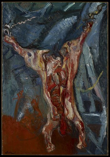
We could even go 'shocking' and create a wallpaper from this as a base template. :shocked:

Where I fear that vegans and vegetarians will come to Bogota and burn you at the stake. :madness:

That could be a point i.e showing off.

Here's the thing:
Just stating that something should have a more modern, sleek, spiffy or whatever look&feel doesn't make it magically happen.... we first have to define what elements actually make it that as well as determine what actually makes a desktop look dated.
So we need to:

  1. Determine what definitely has to be there (find and point to things you like on other desktops)
  2. What definitely does not pass the grade (apparently you have some ideas on that considering your comments about E16)

Of course some dated stuff will be kept and even enhanced to give Retro it's planned vibe but having a modern version/theme alongside will be a necessity.

Note:
I'm referring to the desktop and GUI elements here, NOT missing or hated apps (unless they're part of the desktop like the pager, bar, menu or desktop icons)

Modern is not always good.
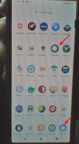
At my beginning with Android (roundabout Version 2.3), I was able to see the difference between the Apps. Today I am always open the wrong one of Maps or Gmail, even if one is on the upper right corner, the other down left.
I am using multiple Phones/Tabs, not every device got the same app-order. So I need to identify the App by picture not position.

The 'modern clean' look is more 'nice to see' as 'nice to use'. But I do believe, there is a middle road between awful old E16 and awful modern Android.

Hmmm, this boils down to:

  • Modern icons look nice but are hard to distinguish which is what.

I think I agree.
Me, for instance am continually opening my 'camera' when I want 'signal' messenger. Which is due to the color settings, I imagine.
In this case the white center in blue apparently is the recognition element for my brain. It isn't too bad on a light background but on dark the 'camera' optically loses its outer ring.

That all icons are the same general form (to have a coherent look&feel) doesn't help to differentiate and if you need to read the text to know what an icon represents, it loses its function.

Given that icons are important (albeit not really defining for a Desktop) what in your opinion makes the modern form look better?
And why are the older formats easier to recognize? Or is it just long term habit i.e the lizard brain kicking in?
I remember a time when 3d icons were modern. :smiley_cat:

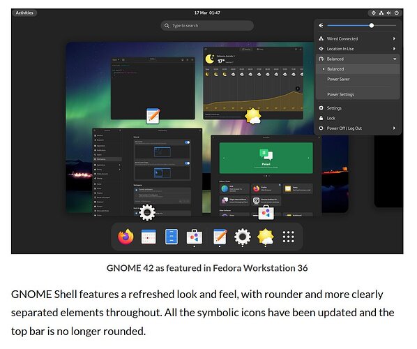
And Fedora uses Gnome 42 in dark mode by default.

It looks like at least they're moving away from flat, candy-colored icons.
I don't think it's bad, it's just not to my liking ....especially the rounded corners on the windows and bar. :thinking:

no time for that :slight_smile: next release is bullseye directly

oh, but about "something has changed" yeah... i got your idea, I still brainstorming it, i think i will include something for that in the next (public) version

sometimes i focus too much in improving and fixing the system itself, i forgot people don't see these things so easily and they better see a visual change like a wallpaper lol

yeah...

yeah, today's "concept of designs" are horrible... they went to minimalistic and becomes things unable to distinguish (between different apps, between what is a button and what is a slider, between -where- is the button because is fsck'in flat, etc...)

they has much more "definitions", details, etc... i think designers are confused thinking "a brain needs to process more information when there's more details included on the image", that's not true, our way of work is not like computers, we don't process linearly details, we process "visual snapshots", the more details the more easy you recognize, your phone's image is a clear example, you need to "think too much" in the very-few details to understand which icon is which one, instead, having a clearly defined image will be instant to differentiate . Similar thing happens to "fonts", when they wants to be too much simplistic for "clarity" they become more difficult to read because they look too similar between them

not even that, for me is not beautiful :slight_smile: do you know what I think the problem on those modern designs come from? i think is something like this:

  1. design is good
  2. but somebody complains about "too much contrast, hard to see, bla bla"
  3. next version: colors are less pronounced
  4. somebody complains about don't like "shadows"
  5. shadows are removed...
  6. somebody complains about don't like so many shapes in the icon
  7. personality is removed from icon
  8. somebody complains about there should be not colors at all, and that having them is racist
  9. ...
  10. somebody complains about the gender name of the icon
  11. and so on...

:rofl2:

the same thing happened to the "cars" in the history, in the past they were beautiful and full of personality, now they all looks the same, a round shape without personality that you can only differentiate by their logo lol

also another difficulty here and everywhere is that "you cannot make happy everybody" (that's a problem i seen in elive sometimes), so the best is to have a clear vision of what and what not (and as said, its a difficulty to pick)

I think we live in a world where is easier to complain than say "I like that", pushing people to be "politically correct" in every aspect, the real evolution of humanity is about being able to accept things how they are, instead of trying to change everything to everyone's vision, diversity is a good thing but must be embraced and loved, humanity is doomed in the other way

2 Likes