E16: New feature: Dynamically configured font sizes

I have recently encountered one of these new laptops with not-so-big screens but with a very very tiny pixels, making it to have a big resolution under a small sized screen, which means: extremely unreadable small fonts

So I was able to work on this, for now the feature is automated but I plan to make a small GUI configurator for it

BETATESTERS welcome! especially @martinwprior :dance:

How to try it:

  • upgrade entirely your system (apug)
  • make sure that you have a screen with a (bigger) not standard DPI value, for example:

~ ❯❯❯ el_dpi_get
157x157

standard should be 96, so if you have bigger, you will see small fonts

  • from the settings menu, create a new user (for a simple betatest)
  • logout your user and then login from the new user, you should see a big visual improvement

Features:

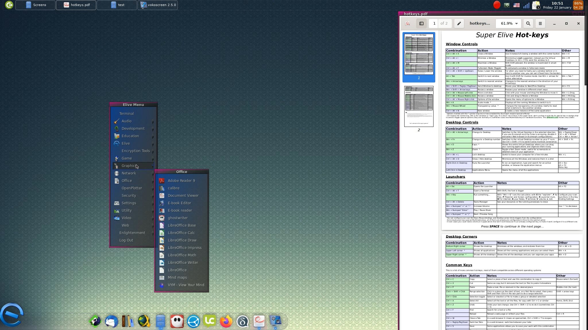
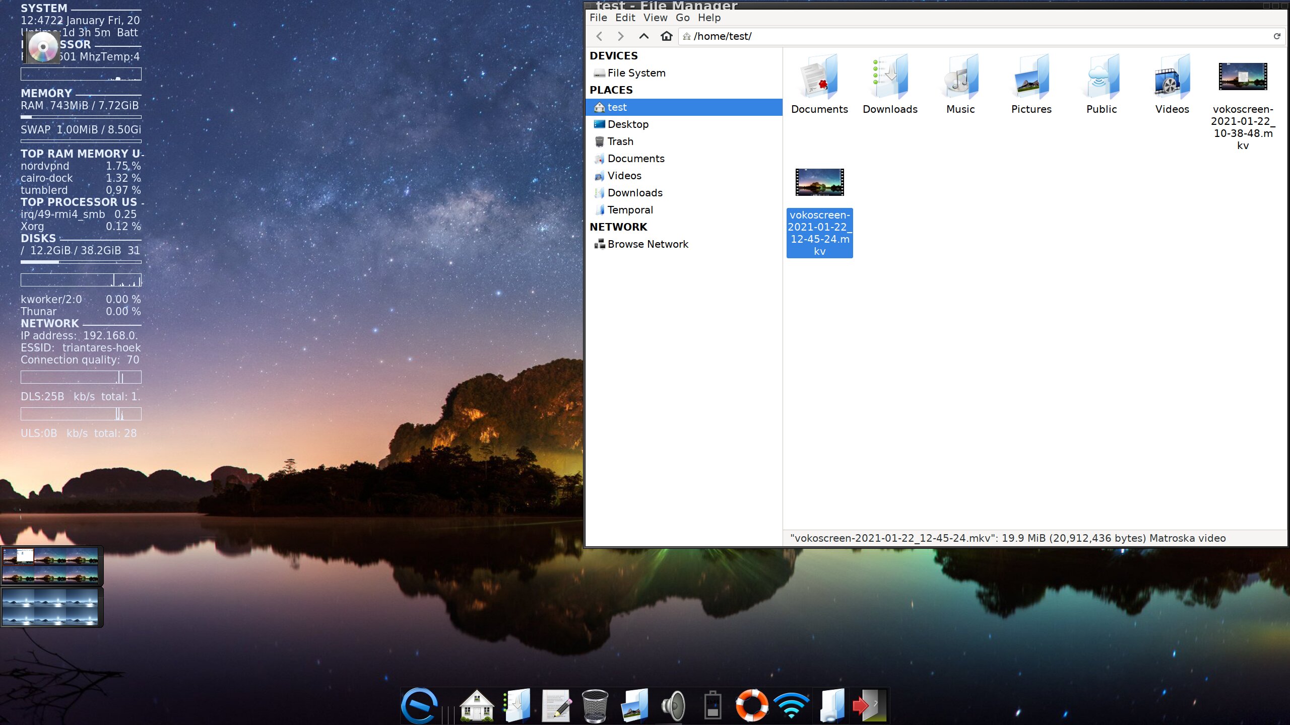
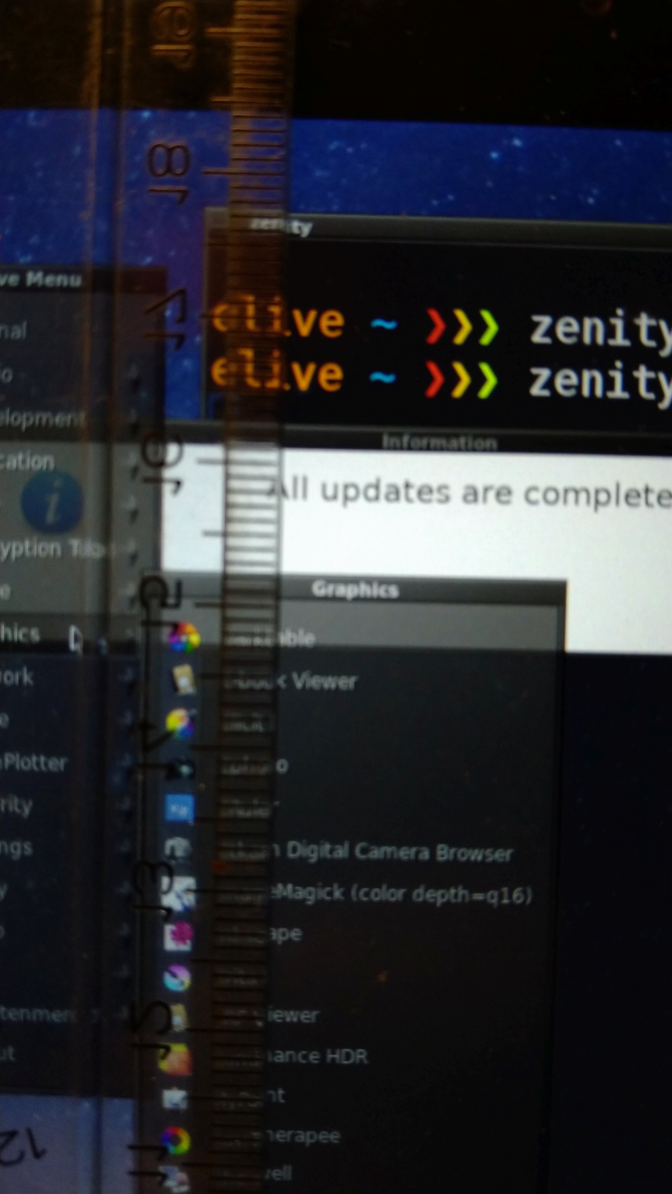
  • includes fonts for terminology, urxvt, all E16 (border windows, menus)..
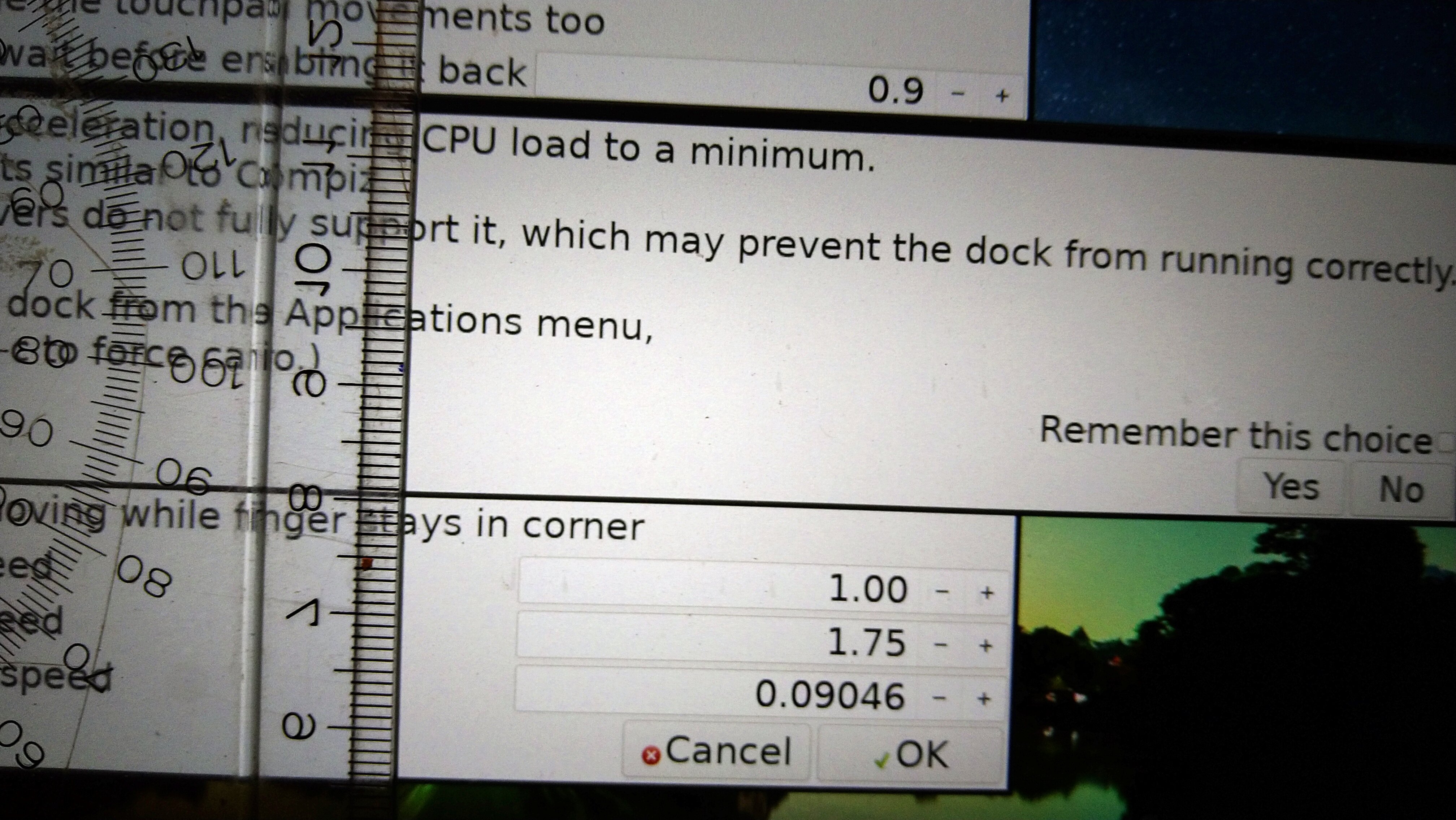
  • cairo-dock (and icon sizes also)
  • conky
  • thunar first-time opened
  • elementary scaling (this includes E24 itself, probably)
  • others dynamically included

Betatest needed:

  • anything missing to include please tell me!
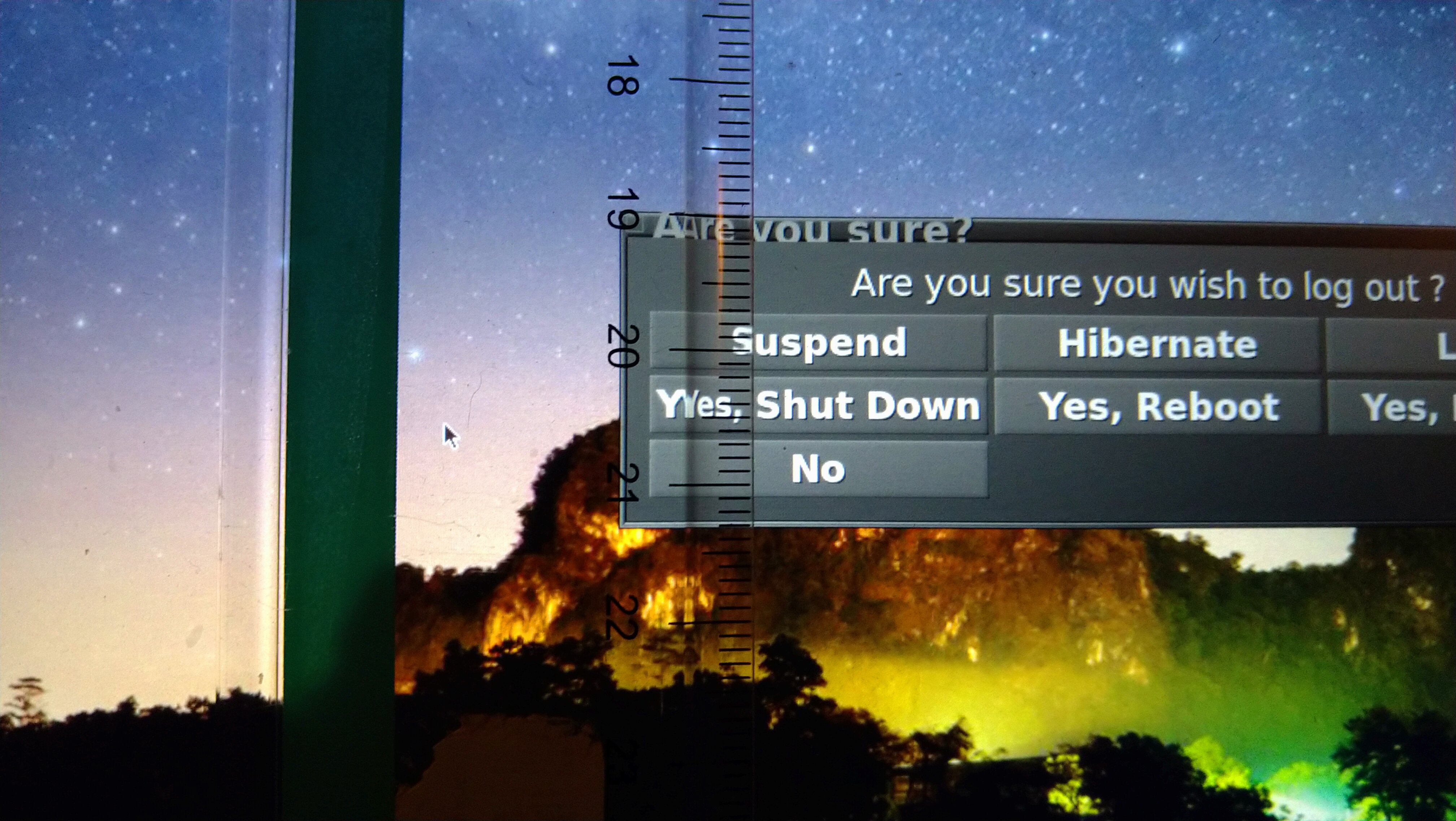
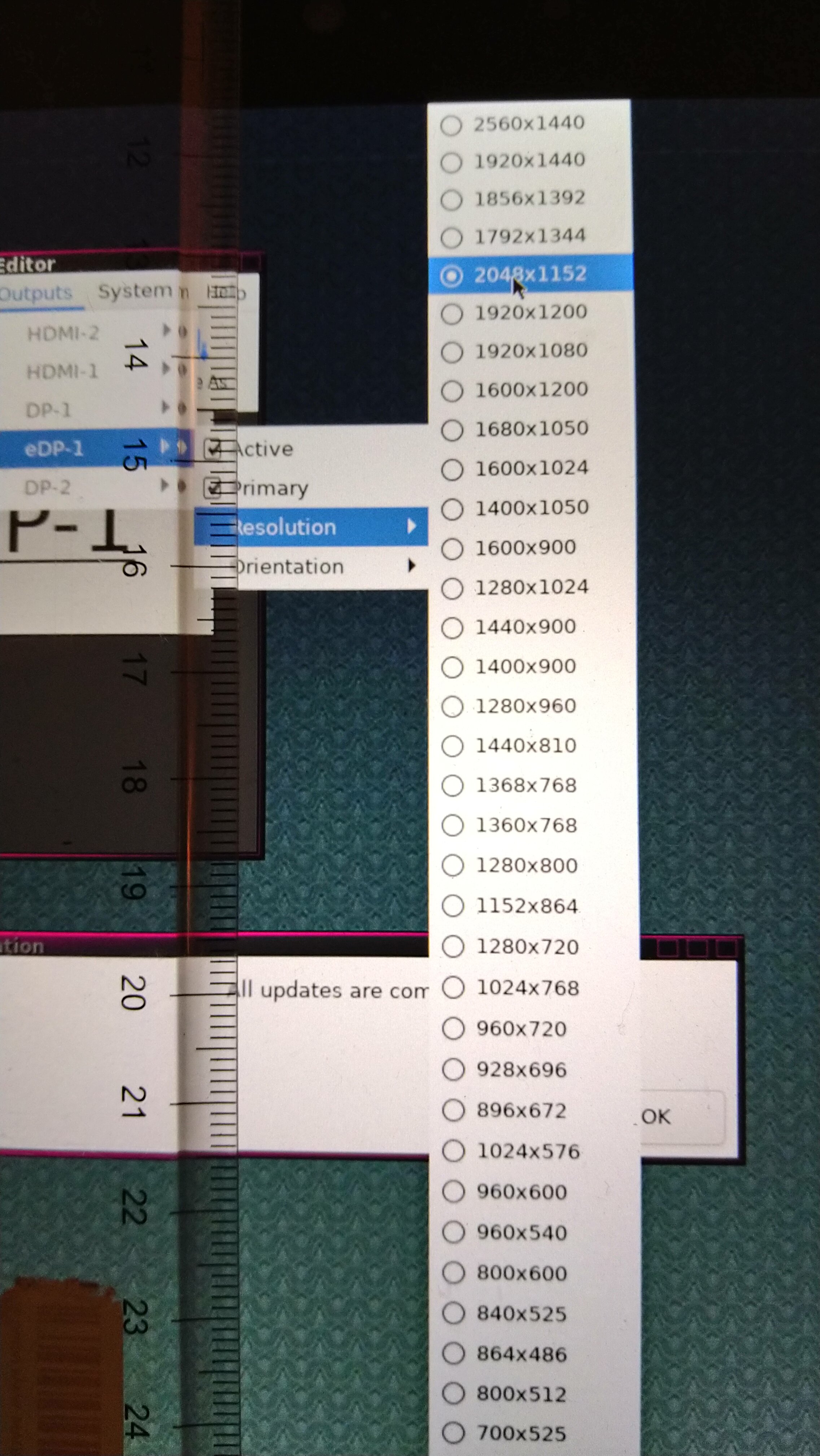
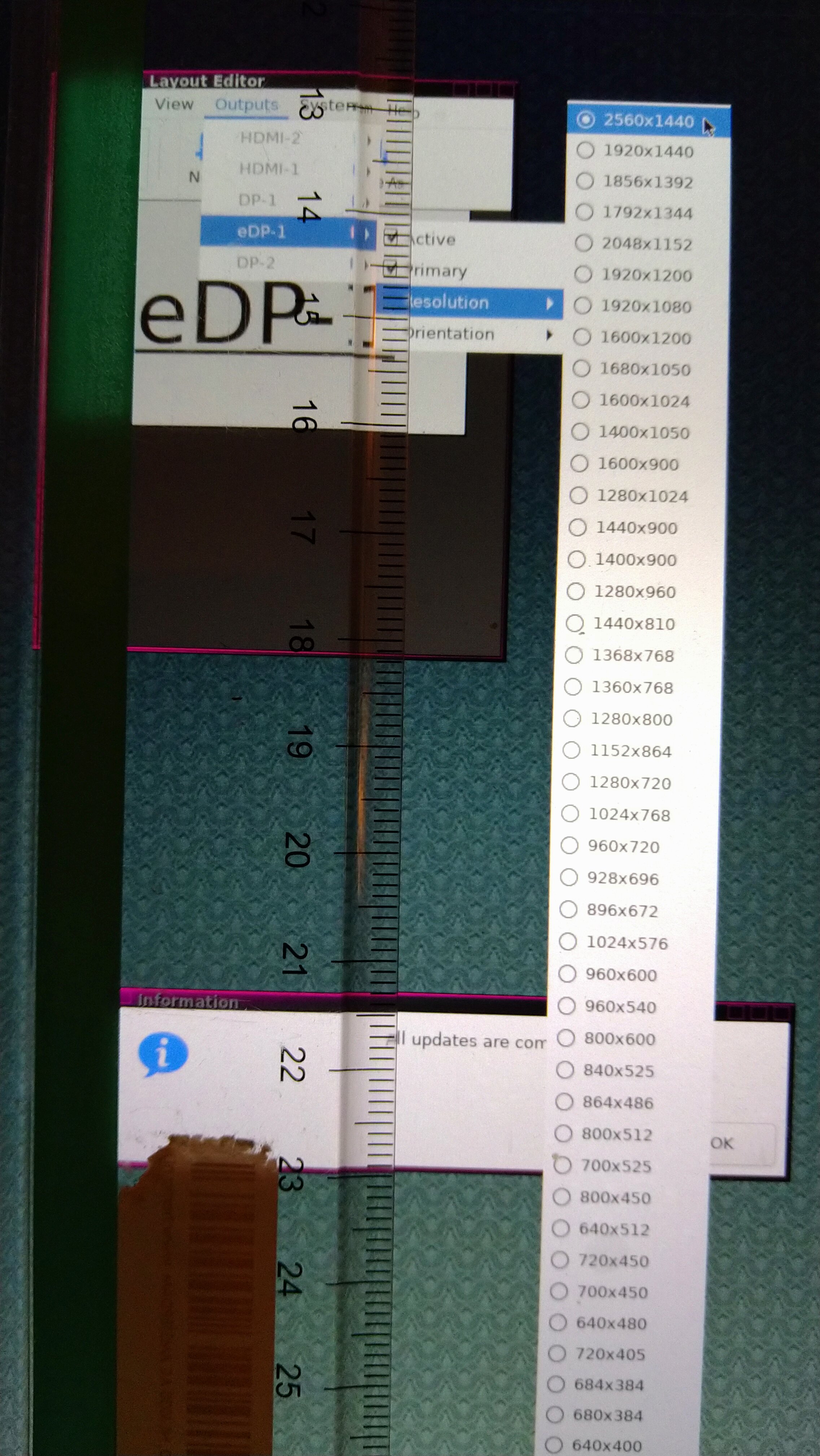
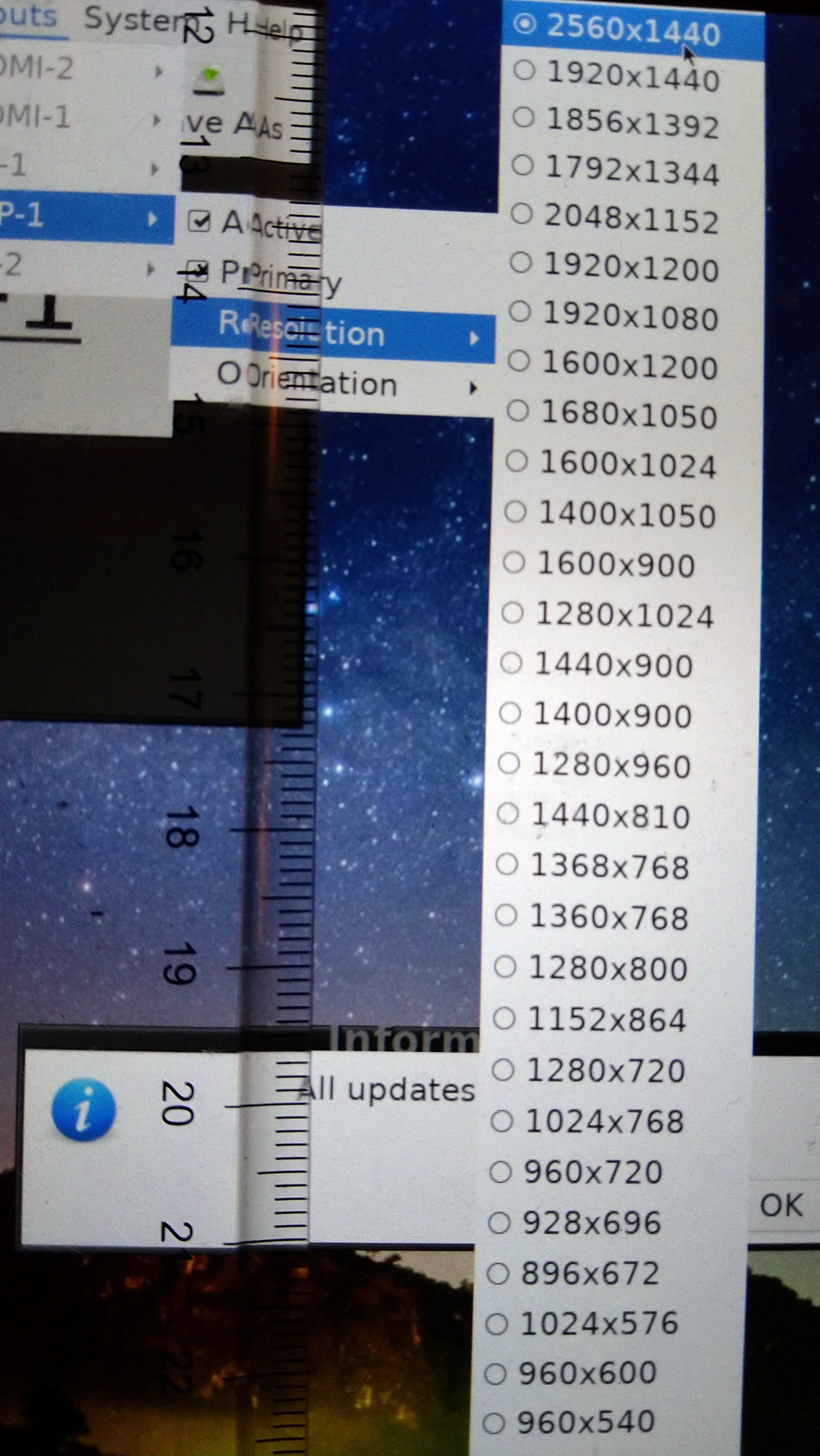
  • if you see anything wrong, share a screenshot here
  • if you think the font or visuals are too big, comment also! (in fact, the smaller the fonts the better, more elements can fit in your screen!)

mentions: @triantares @TheTechRobo

1 Like

I don't have that command. :confusing:
After "apug" I do have it. :smile_cat:

el_dpi_get
167x168

I did a test on my X1 creating a new user (called test) and logging in.

el_dpi_get
209x210

Here's my impression:
The welcome widgets and cairo-dock are gigantic and actually quite intimidating compared to the hotkeys pdf. It's a mess.
It makes the screen look like it's some old low-res stuff :frowning_face:

You can check out the vokoscreen for "test" at 2560x1440 as .m4v here:
http://triantares.ddns.net/Elive/Screens/test-2021-01-22_10-38-48.m4v

compared to my standard (toned down to 2048x1152) E16 desktop here:

If all machines have this new kind of messy fonts, that would be very bad. :shocked: .

Accompanied by a vokoscreen mp4 session which wouldn't run on my Firefox :confusing: but is fine when downloaded.
So I ran it through "handbrake" to web optimized m4v at 1920x1080. :+1:
http://triantares.ddns.net/Elive/Screens/triantares-2021-01-22_10-50-57.m4v

So I think maybe we should be offering an easy way to lower the resolution and test with, like a direct link to "arandr" (I've got a Fn& F7hotkey-combo) i.e not the Elive-screen-configurator. That one asks too many questions and nags about saving it....it's a real PITA if you change the settings a lot on the fly (like with external screens).

E24 has plenty options to manipulate the screens (like magnification), so I wouldn't be too worried there.

Font size is handled in so many places and quite often randomly by the apps themselves that IMO you cannot do right here, in creating a coherent environment for all resolutions.

I think we should stick to 4k (1920x1080 -- 157) as size for optimal design to be a "catch-all" and have the First-Time-Run script probe for available higher resolutions and -- subsequently offer the new user to test and apply higher (or lower) resolutions.
This has to be done before starting conky as a resolution change (and back) will make it go to the left of the screen. A re-login puts it back to the right BTW.

We , after all do cater "give old hardware a new span of live". :nod:

your X1 has half sized pixels dimensions (traditional screens are 96, you have 210), this means the default fonts that shown before for you was half of the default sizes meant to be, on which there's 2 important points to consider:

  • we are used to them, and we loved them, because:
  • it is better to have smaller fonts if our eyes can read them, so more contents fits on the same screen

By other side, the correct size of the fonts should be 2mm height for shifted (caps) characters, this is the default by apple which im very convinced they did good eye studies for select these sizes :slight_smile: - in other words, try to measure them (is not easy) and tell me their sizes, I think that after to do a few tests in screens we can reconfigure the new fonts systems to use better defaults based on the dpi's

the idea is to provide readable fonts for everyone, but even better, the perfect font sized (by default) for them without need to select them

win + p (projector) :slight_smile: which I think is the same as on windows (useful for people that uses the same keys, like alt + f4 to close lol)

btw why your resolution is not the bigger one? your screen should look better (and then if the fonts / sizes are too small, to change their settings)

yeah that's why we need a generic way to be able to configure all, but let's start with an auto tool and then we will have a dedicated gui :thinking:

nope that's the problem, some screens has very small pixels (new ones) and they are unreadable using defaults, at the same time the default has always been 96 and so 157 should be too big and wasted, so the best is to calculate the size of the pixels in order to represent these fonts, but I didn't do any test yet with special computers (maybe in 2 days I have access to the one with the very small ones lol)

yes the tool try to configure it before graphical system, but about screen resolution, we should use always the bigger one, otherwise we would have blurry pixels :thinking:

This would be absolute on all sized screens, I take?

I took the measurement of the "logout" widget....and it wasn't easy, indeed. :nod:
On triantares(2048x1152) they're 2mm and on "test"(2560x1440) they're 3mm

Starting E24 (first time) for test, the beginning has the adjusted fonts

But after a few clicks goes back to the small font.

While this is what E16 looks like:


Clearly the fonts are too big for the widget border too. :shocked:

Compared to E24

1 Like

It's not just the fonts, it's the whole desktop that is a strain to the eye after a while when it's that small.
When using an app that allows resizing then i.e when needing to find a file from the built-in file-chooser, it's too small again. :frowning_face:

It was one of my earliest gripes when Alpha (Beta) came out:
I couldn't use the menu on through the touch-screen 'cause my fingers were too big i.e the widgets too small.

On top,
I don't have any other screens that have a similar high resolution, not even my drawing-tablets (they come at 1920x1080).
So there's nothing I can use as a second screen (yet) without losing some screen area.

1 Like

yeah exactly, a standard for all, all fonts should be 2mm in caps mode

I just tested it in a 157 dpi screen and the GTK fonts looks like exactly that, also the elementary menus (the menu from terminology for example)

by other side, terminology had too big fonts, so i just changed the default 12 to 10, which probably has been increased in the past due to lack of legibility in screens with higher dpi

interesting, let's use the zenity widget as base for the main tests for simplicity, example:

zenity --info

and mesure the caps fonts, or the "L" which is already large, we will verify all the other font sizes independently later...

so in the case that this zenity looks 3mm VS 2mm in your screens, what can cause this? the dpi value get is based on screen size VS resolution (amount of pixels), so if im not wrong the result should be the same in all screens everytime :thinking:

note: forget about e24 since it has its own way to configure font sizes and its another much deeper topic and lets focus to a standard plain desktop :slight_smile: like e16, which is also our base

are you sure? i see the words in the menu to be exactly 2mm :thinking: (nice clear photo BTW, cameras are better than human eyes haha)

I assume you are talking about e24, e16 looks to be fine (in the very few tests that i have do yet)

well, if we are talking about the fonts, that will be fixed in the next builds using this new system, but if we are talking about the "window borders" of e16, they are static and cannot be changed so we cannot do much here except using a different theme (or switch to e24+)

warning: a second screen is not yet supported yet at automated fonts, or more exactly, it should be the first one that only counts

2 Likes

Well you can see in the picture that that the (probably 12 pixel) menu border is smaller that the font ... that can be a problem.

I'm worried we're opening a can of worms with the font resizing i.e touching on the weak side of linux ---- it's a mess of applications not keeping to the rules a coherent distro essentially requires. :shocked:

Will do. :nod:

No, specifically E16. The general layout is fine and with a higher res it looks sharp, certainly.
After working with it for a longer period, it gets to be a strain and lowering the res a bit is actually quite comforting.

On my existing E16
Now setting the higher res:

and with user "test" (with dynamic fonts) logged in at TTY2 and using "startx /usr/bin/starte16 -- :1":

So it is getting better. :smile_cat:

1 Like

we cannot do much with the borders (static images), but the title was indeed always too big so i just decreased the default font size from 9 to 8

yeah looks good :slight_smile: now if you apug, the e16 themes will have a smaller font for the borders (probably not perfect yet, i should decrease another point? try it in fonts.pango.cfg for the border entry and reloading e16)

Can't we do anything with borders/menu.cfg?

I wanted to move the pager bar to the left and have the pager shade _LEFT too and edited borders/pager.cfg for that.
The shading direction change works as well as the resizing of the border on the left ..... but the it's still the right hand border that induces the shading.
Haven't found a way to change that.:confusing:

themes includes different borders selectable (also for pages), have you tried the other alternatives?

about menus, well they are static images so should be needed to re-theme everything, and that's quite amount of work that will also change the default look of the theme

No, I haven't but you're right --- I should look if there's anything comparable around and get pointers from that. :nod:

Anyway "apug" reinstalled E16 so my mods (in /usr/share/e16) were back to what they were before...so I can start off fresh again.
:dance:
Found it in the first one (23ozglass) there's a PAGER_LEFT in borderstyles.... and in Detroit a PAGER_RIGHT option.
And "winter" has them all and they work, even "autoshade" is interesting. :madness:

i did a few test in live mode (using persistence is easy to "always have the last build", so it updates the packages and the booted iso in persistence will have the last updates), and before there was a strange problem where the fonts were double-big (too much, more than 2mm, very annoying look), but in the last updates seems like all looks correctly for me now :thinking: I still need to betatest in the very-small screen laptop

To be clear I'm using "retrowave" theme here on my default desktop. there's subtle (well sometimes not even that) differences in the theming here and there.

What is the default anyway, "elive-dark" ??? :thinking:

New user "elive' with 2560x1440 res. starting up.
It's a shambles .... too many different font sizes!

This is what startup looks like i.e even worse:

Where first impression is soooooo important.
I'm worried this is a "fix it till it breaks" scenario. :frowning_face:

1 Like

yes, but i updated retrowave too, since is almost the same code

mmh that doesn't looks very correct, they looks very small, right? :thinking:

btw you need to "apir terminology" because the new version is not installed (same version number), including the change of the font size from 12 to 10

maybe is not working good, -yet-

your second screenshot looks to have good sized fonts (more or less 2 mm), but looks to me very big as a widget first-impression (if this is the case, it didn't happened to me again in my last test but it happened before)

Exactly , too big. The caps are nearly 4mm.
It's the first widgets that shows when a new user logs in for a first time.
Terminology isn't the only one with still small fonts, so is the launcher menu pop up.

It took me a good amount of time to fine tune it and bugfix and make it behave correctly... but I think that now its just perfect :slight_smile:

the version 3.8.19 includes all the auto sized things set up and should be the correct sizes for all, automatically, of course we could prefer a bit smaller or bigger but -that- should be the correct size for all and all the desktops:

2 Likes

Well I recently did an upgrade of Ubuntu18.04 to Elive 3.8.18 on an old Thinkpad X260 (mentioned in another thread) and was initially shocked on how bad fonts looked on first boot, i.e unreadable:

or way too big:

Luckily the 2nd reboot sorted that out by itself but it wouldn't be a nice experience for a first time user. :shocked:
So anything that remedies that is quite welcome. :nod:

Yeah all those issues has been fixed, I didn’t tried a recent upgrade but should work perfectly as same the version 3.8.19

I just booted a very old installation ... then upgraded it. After that, I restarted the configs for cairo dock and the terminal using elive-skel (which is NOT friendly at all to me ... will try once the system has fully upgraded but it talks about e17 and also doesn't have that many options). Then I used the menu system to "restart desktop configurations" (missing from elive-skel). That's it.

I can't see the terminal text anymore; it's too small.

Reboot didn't fix this.

Try running "apug" and see if that clears up what you need.
As a workaround for the small fonts, run that from a VT ..... i.e Ctrl, Alt & F2 keys.
Those fonts will be usable. :nod:

BTW there's also an Elive-dark with big fonts theme available.